Services provided:
- Logo Design
- Brand Identity
- Web Design
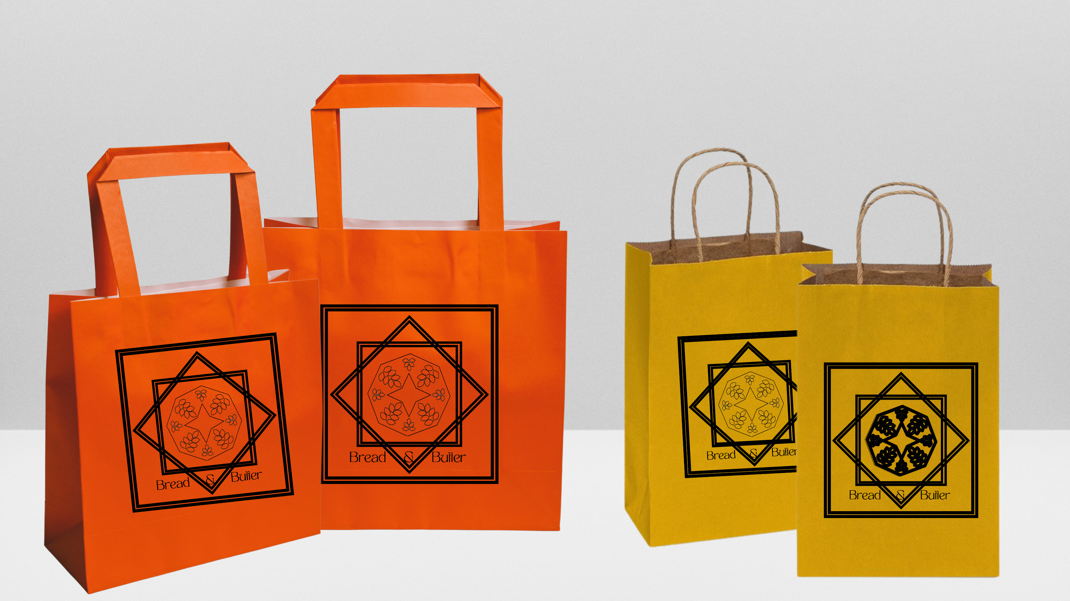
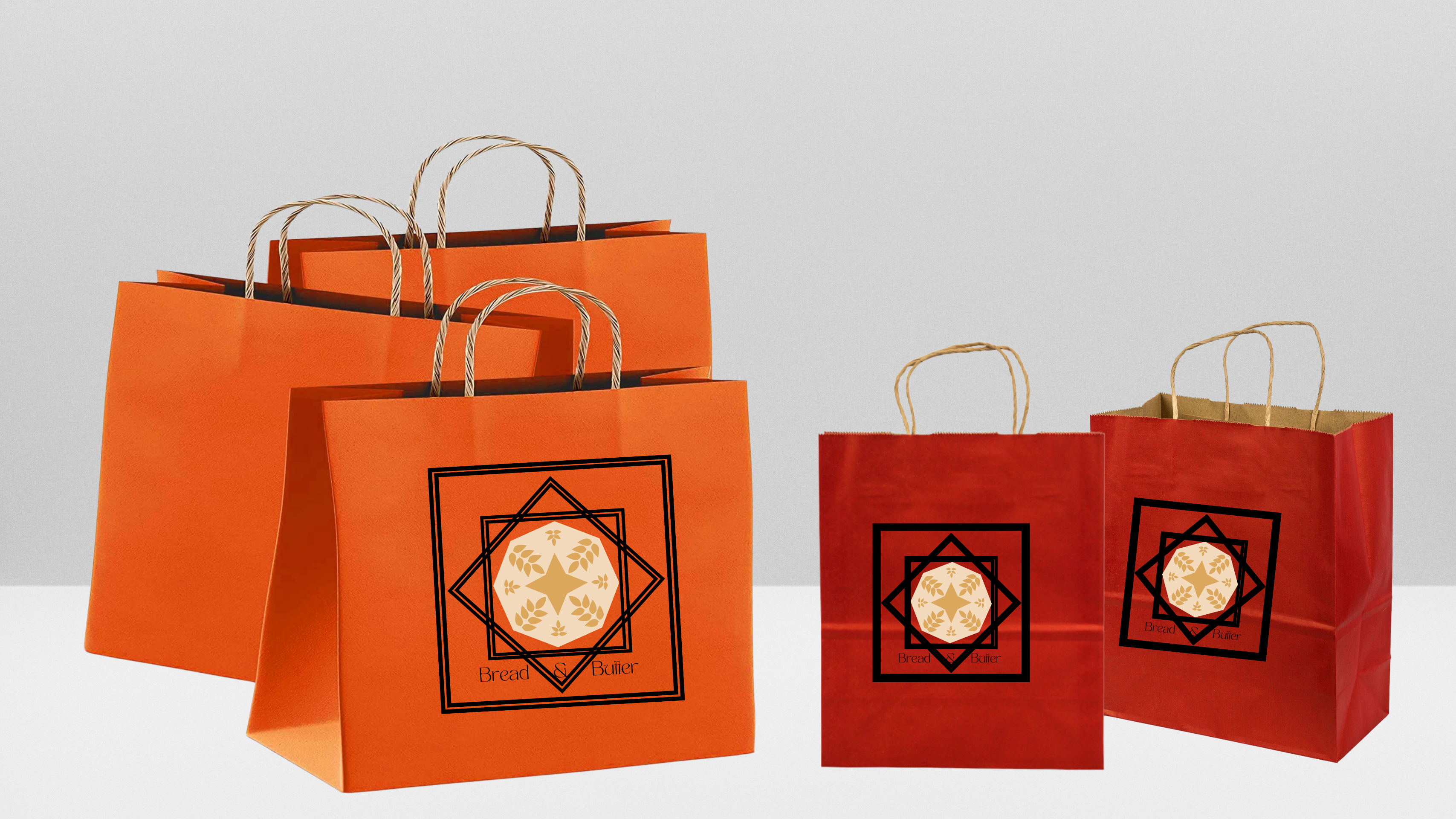
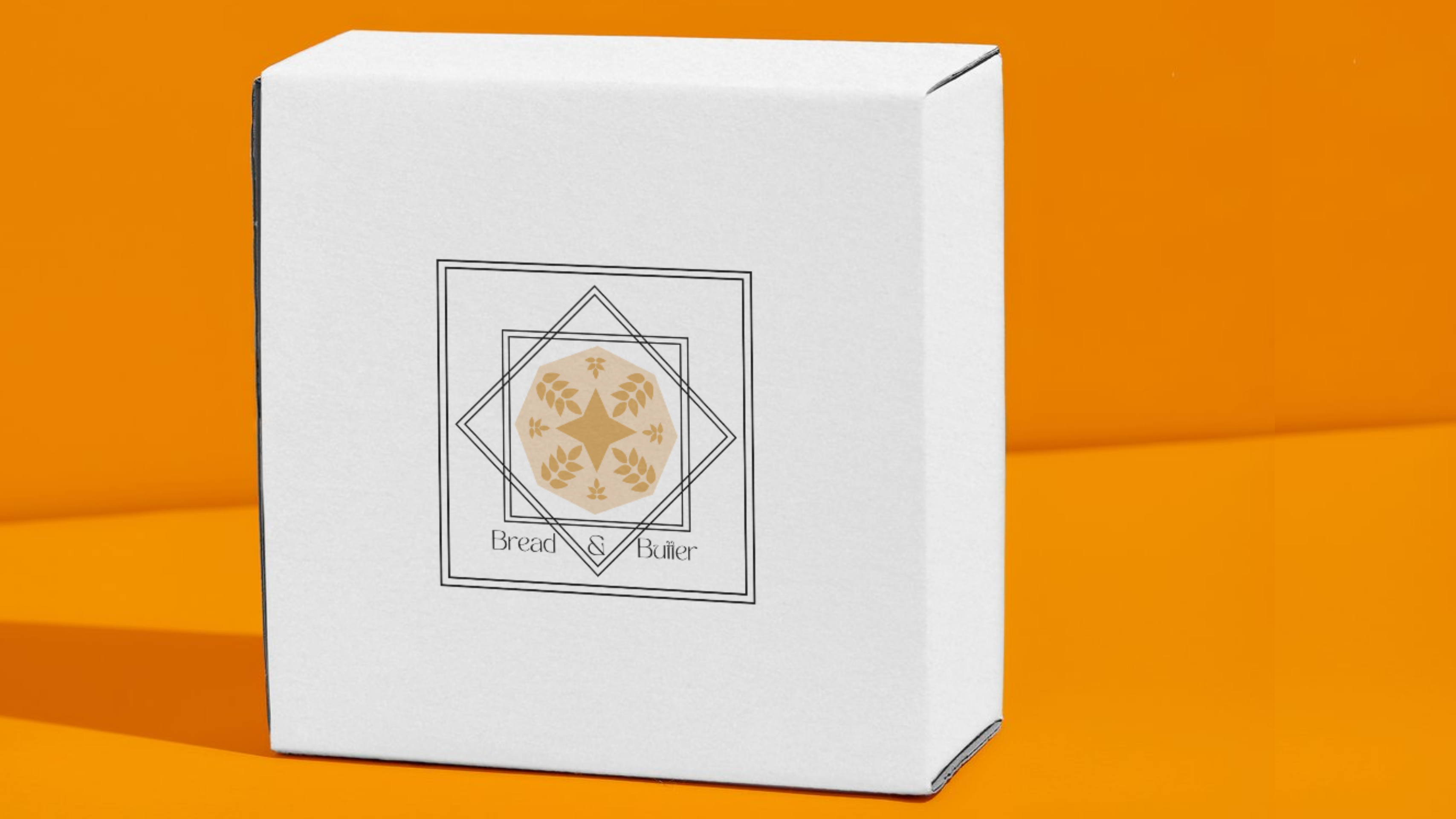
- Packaging Design
- Business Cards
I like to try to maintain a balance between things that are current, innovative, and traditional. This is one of those projects that really pulls in those traditions. For the sake of building my portfolio, I asked ChatGPT to create companies and scenarios for me. The company is as follows:
- Client: A small bakery that specializes in artisanal bread and pastries. They pride themselves on using locally sourced, high-quality ingredients and offering a personalized customer experience.
- Design Request: The bakery is looking for a new logo design that captures their brand personality and stands out from the competition. The design should be modern and minimalist, while also conveying a sense of warmth and comfort.
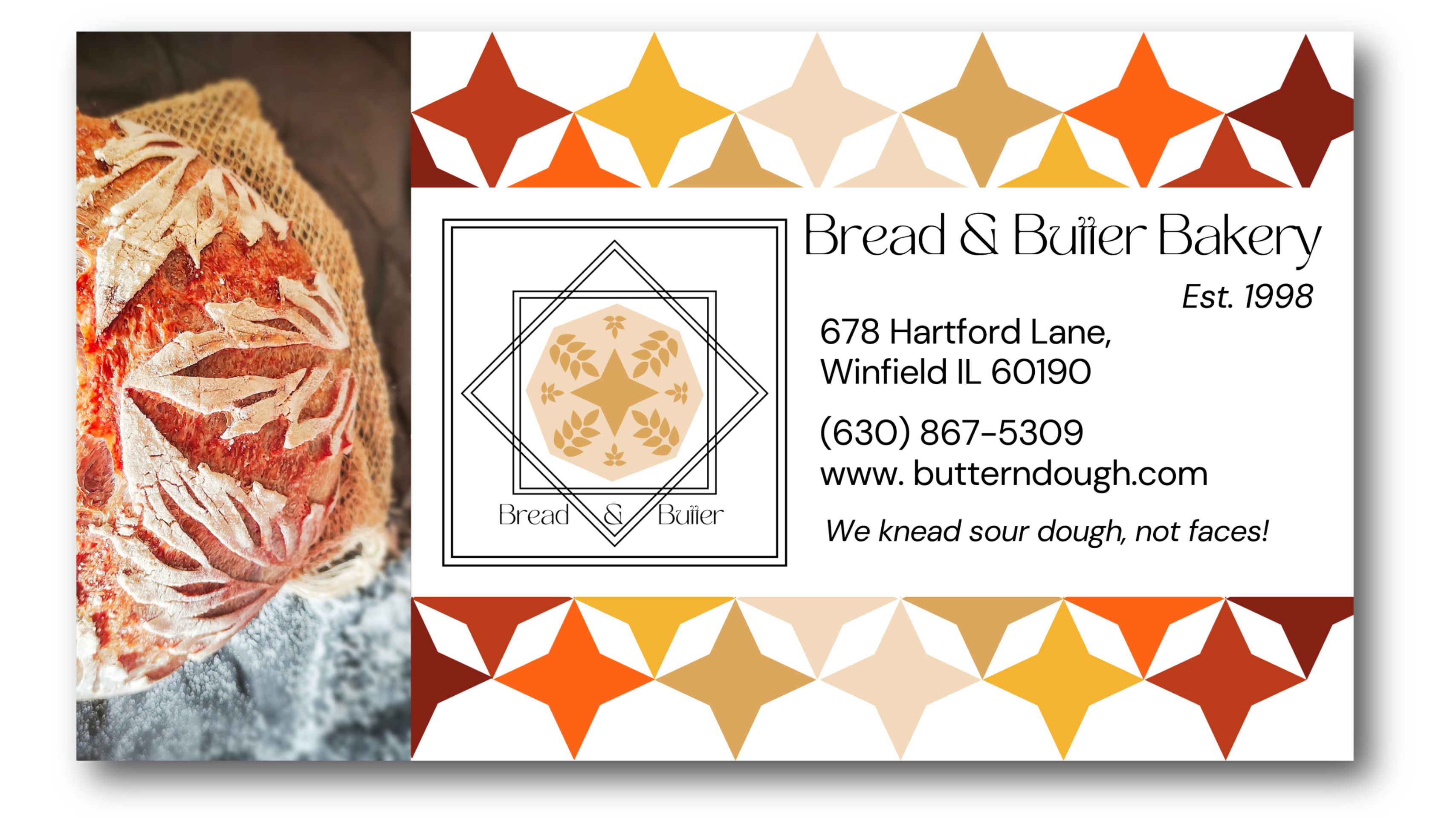
- The bakery’s name should be included in the logo: “Bread & Butter Bakery”.
- The bakery owners would like to incorporate an image or symbol into the logo that represents their commitment to using local ingredients and sustainable practices.
- The logo should be versatile and work well on a variety of materials, including packaging, signage, and online platforms.
- The color palette should be warm and inviting, with an emphasis on earth tones and natural shades.
I then asked my “client” several questions to gain more knowledge about the company before I crafted a mood board for my design.
- How old is the bakery?
- Where is the bakery located?
- Is there a cultural inspiration to the baked goods?
- What part of town are they located in?
- What is the mission statement if any?
- What is their menu?
- Which baked goods are their specialty?
- What kind of grain do they prefer?
- Would they like to incorporate the traditional with the modern aesthetics for the logo?
- What else are they looking for besides a logo?
My “client” responded as follows:
- The bakery was founded 25 years ago by a local family who wanted to bring traditional European-style baked goods to their community.
- The bakery is located in a small town in the midwestern state of Illinois, with a population of approximately 10,000 people. The town is known for its friendly community, historic architecture, and vibrant downtown area.
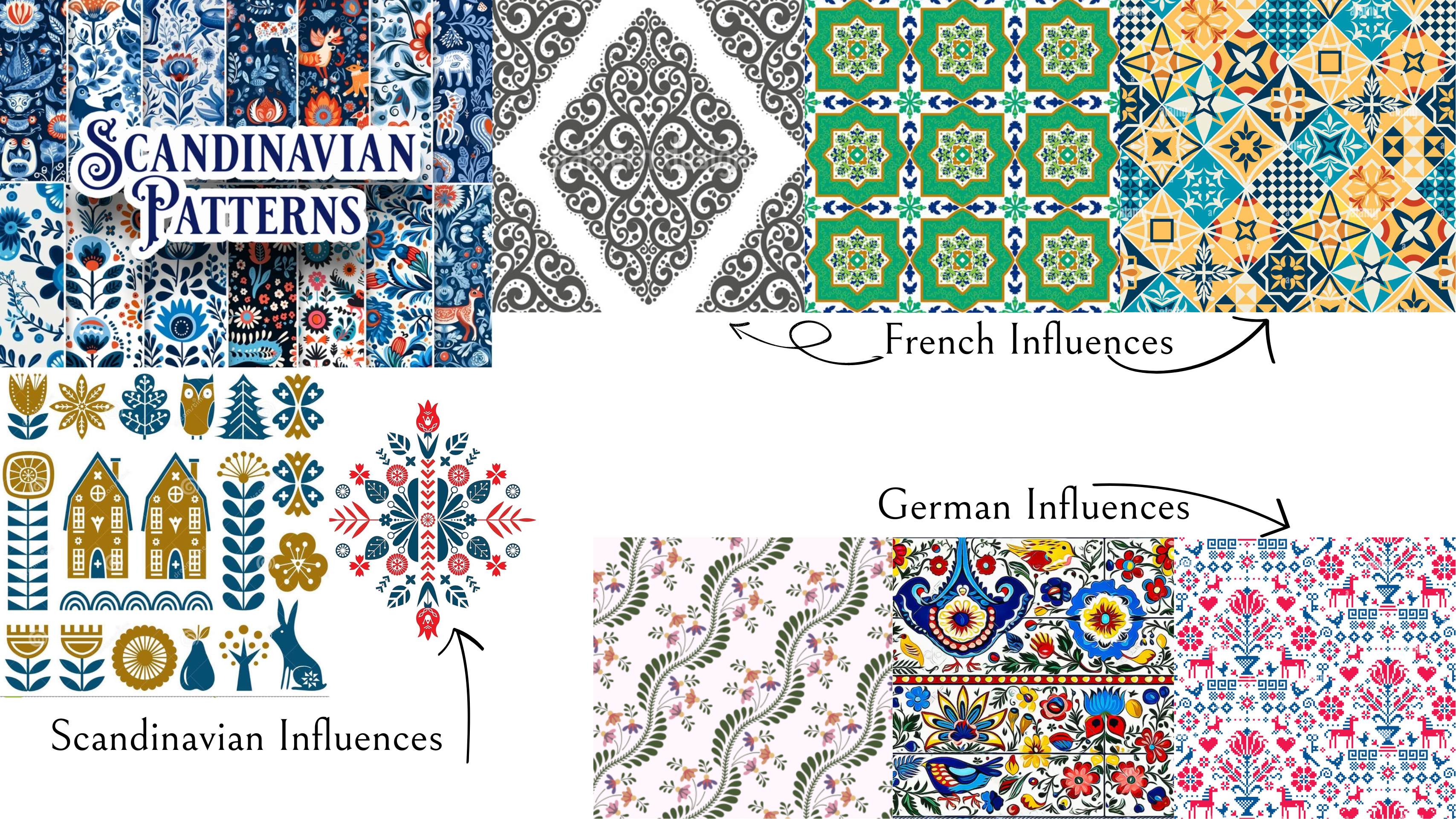
- Yes, the bakery takes inspiration from traditional European baking techniques and flavors. The Midwest is also known for its strong German and Scandinavian heritage, which has influenced its cuisine and baking traditions. Sourdough bread, for example, has its roots in Germany, while traditional Swedish cinnamon rolls and Danish pastries are popular in the region.
- The bakery is located in the downtown area of the town, near the town square and other small businesses. The town square is a central gathering place for community events and features a large gazebo, benches, and green spaces. Surrounding the square are a variety of small shops, restaurants, and local businesses, including Bread & Butter Bakery.
- The bakery’s mission is to create artisanal bread and pastries using high-quality, locally sourced ingredients and traditional baking methods. We strive to create a personalized customer experience and to promote sustainable practices in their community.
- The menu at Bread & Butter Bakery includes a variety of bread, pastries, cakes, and other baked goods. Some of their most popular items include sourdough bread, croissants, cinnamon rolls, and fruit tarts.
- The bakery’s specialty is their sourdough bread, which is made using a traditional sourdough starter and a slow fermentation process.
- Bread and pastries made with organic whole-grain flour, such as wheat and rye, and locally sourced honey and butter, and no preservatives or additives.
- Yes, the bakery would like to incorporate a modern aesthetic into their logo design while also paying homage to traditional baking techniques.
- In addition to a logo, Bread & Butter Bakery may also be interested in branding materials such as business cards, packaging design, and a website to showcase their products and services.
The Process
To get a further feel for what kind of location my fictional bakery would be located in, I researched towns in Illinois that matched the population size, and description my client provided. After some, searching, I based my location in the town of Winfield, Illinois. Location is important to me to get a feel for the architecture, culture, demographics of a place so I can consider the spirit of my client’s community in the process. Below is a brief slideshow that captures the town of Winfield, IL.


I started my process by looking to actual sourdough bread. I noticed that there was an art to the process known as “scoring.” There are several patterns, but among the most common is a leaf-like one. Below is the bread scoring portion of my moodboard.
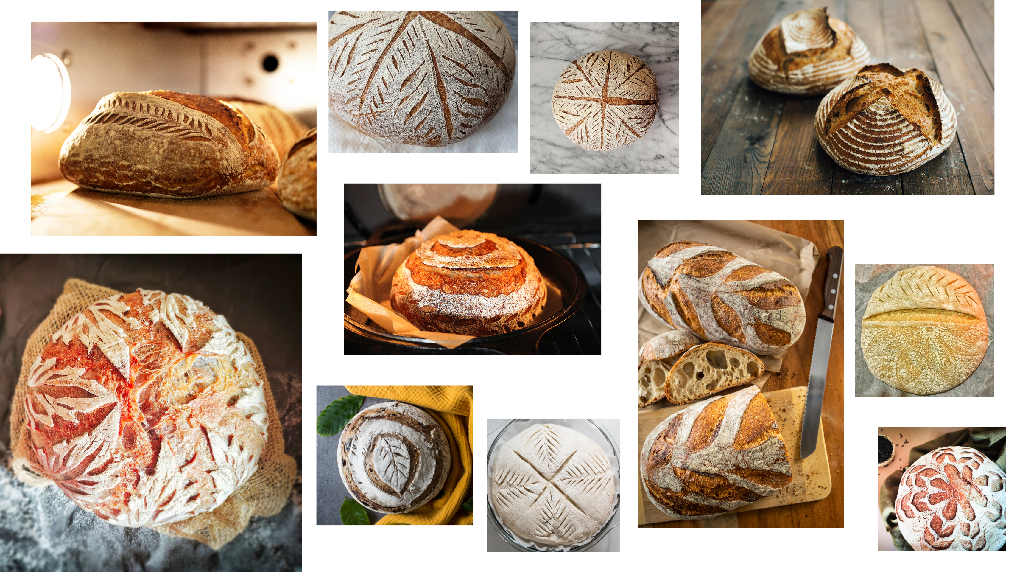
I also researched how scoring and preparing sourdough is accomplished see here.
I noticed that the scoring patterns looked similar to some of the traditional folkart patterns of the cultures suggested by my client. See examples below.
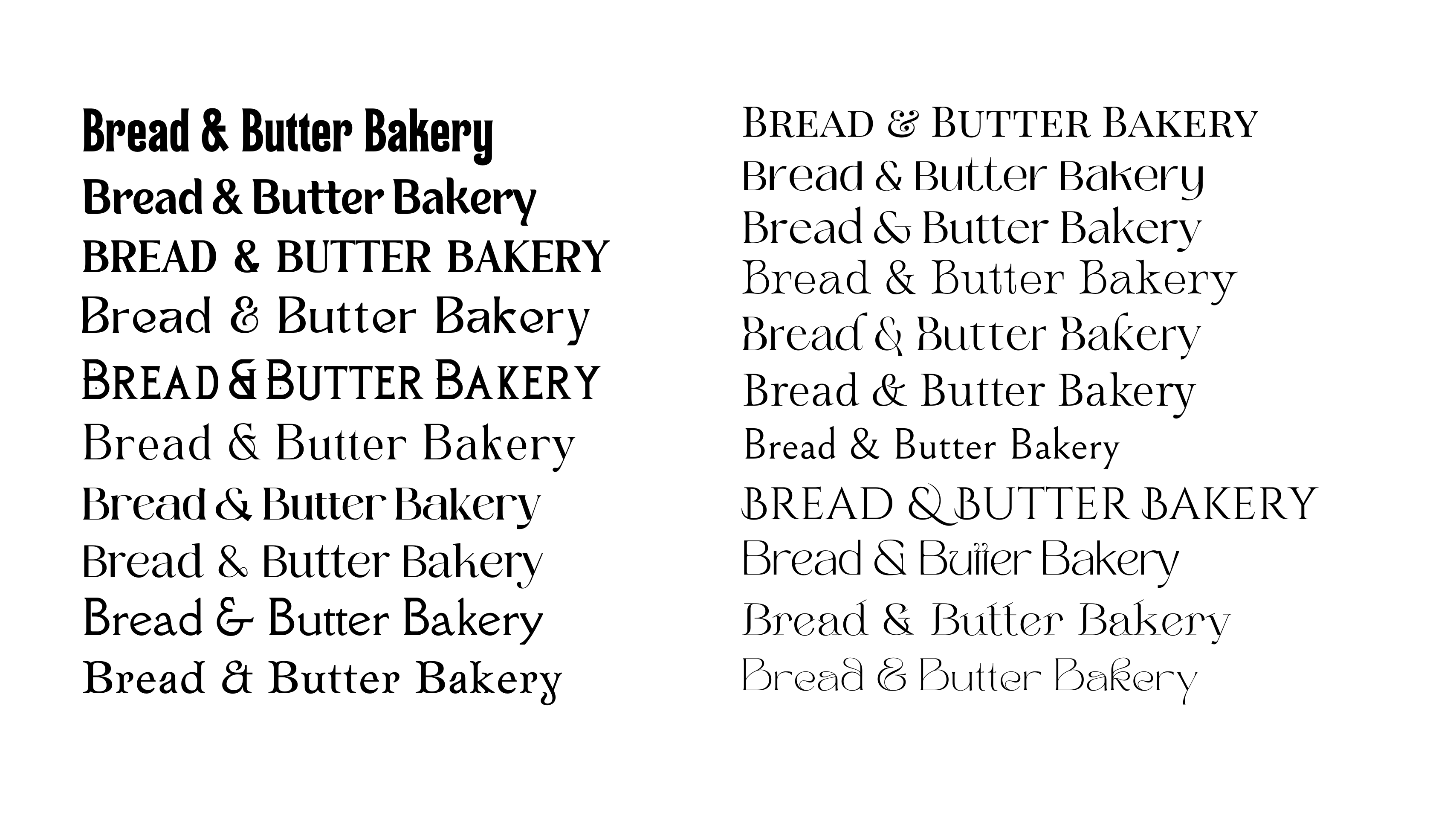
The next step of the process was to research what other bakeries were doing with their websites: I posed the question as to what types faces were common or stylistically speaking relevant to bakeries of this style.
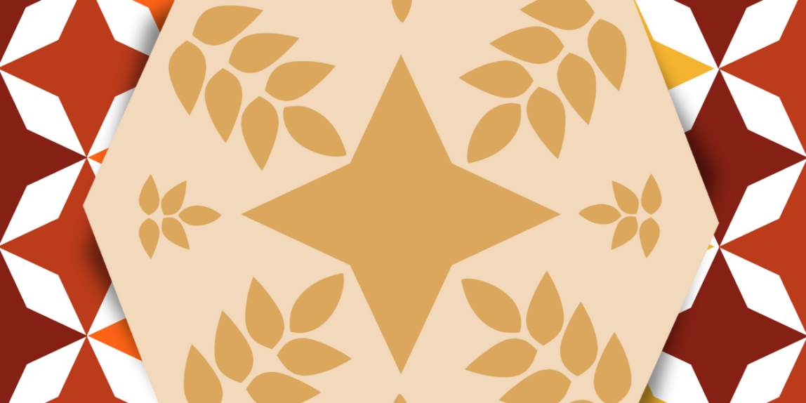
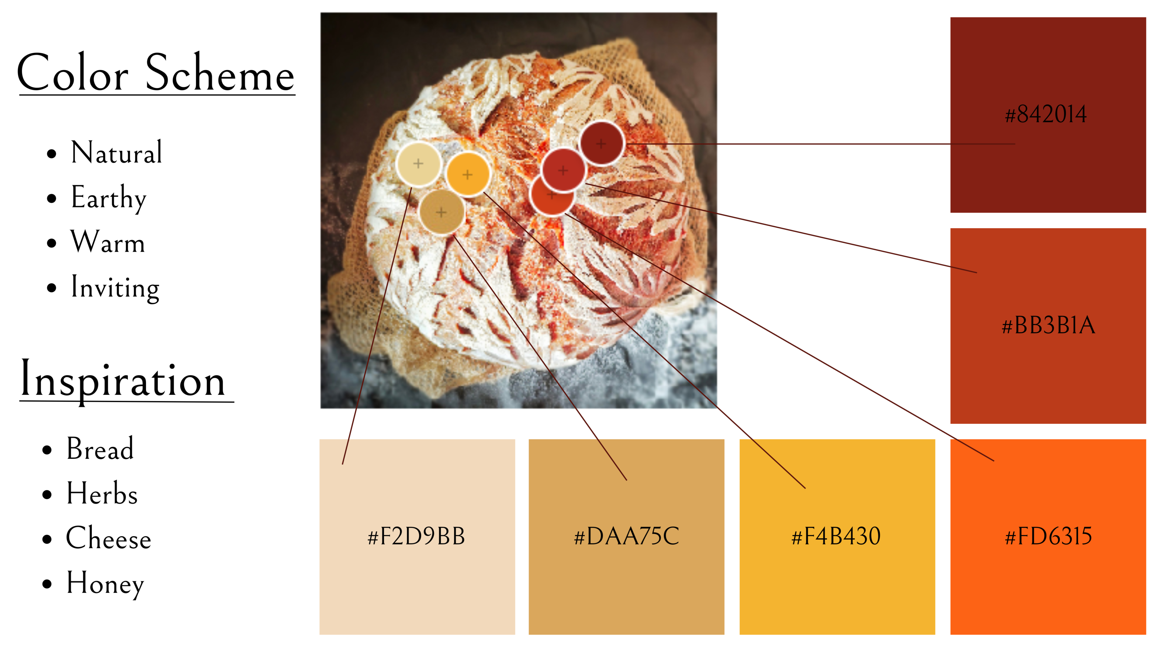
After completing the research phase, it was time to select color. The client wanted, “color palette [to] be warm and inviting, with an emphasis on earth tones and natural shades.” So I went back to the bread; bread contains tons of neutral colors and earth tones. One picture in particular came to mind as some of the colors were rich, inviting, and earthy. See below.
Once I determined my color scheme, I began to deconstruct the essential shapes of a scored sourdough. When simplifying the design I took the client’s desire to “incorporate a modern aesthetic into their logo design while also paying homage to traditional baking techniques,” into consideration. Modern aesthetics often involve angular shapes and simplified patterns. Below is the pattern I came up with.
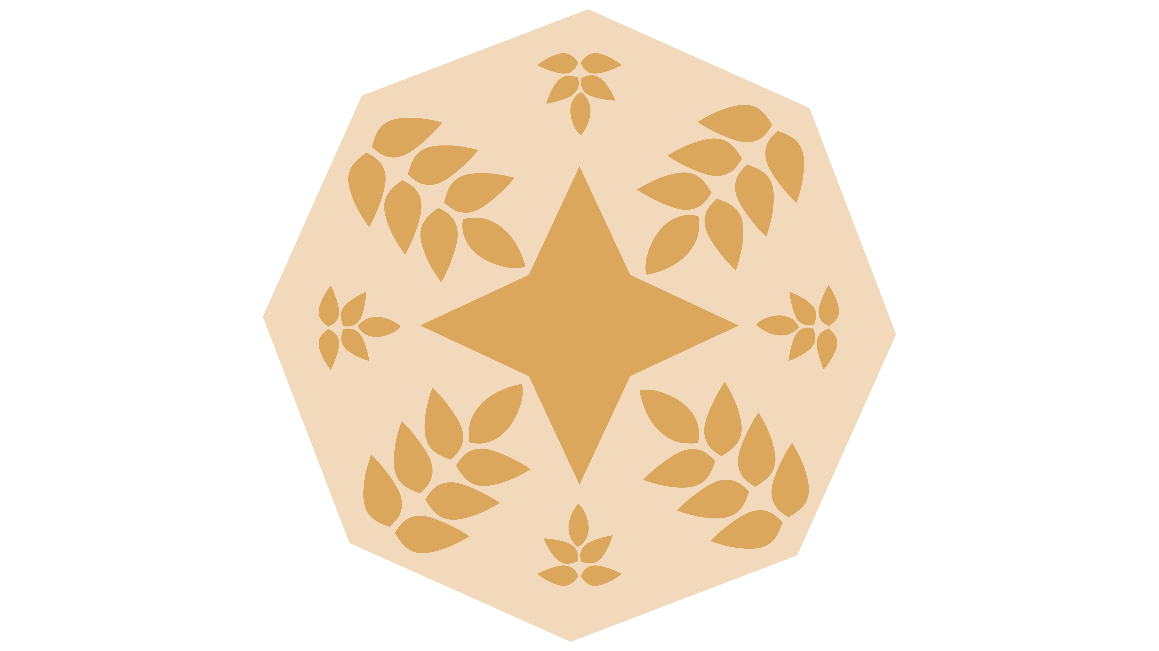
To continue with the idea of something more modern, and to really incorporate some of those folkart elements I created a beautiful geometric boarder for the design.
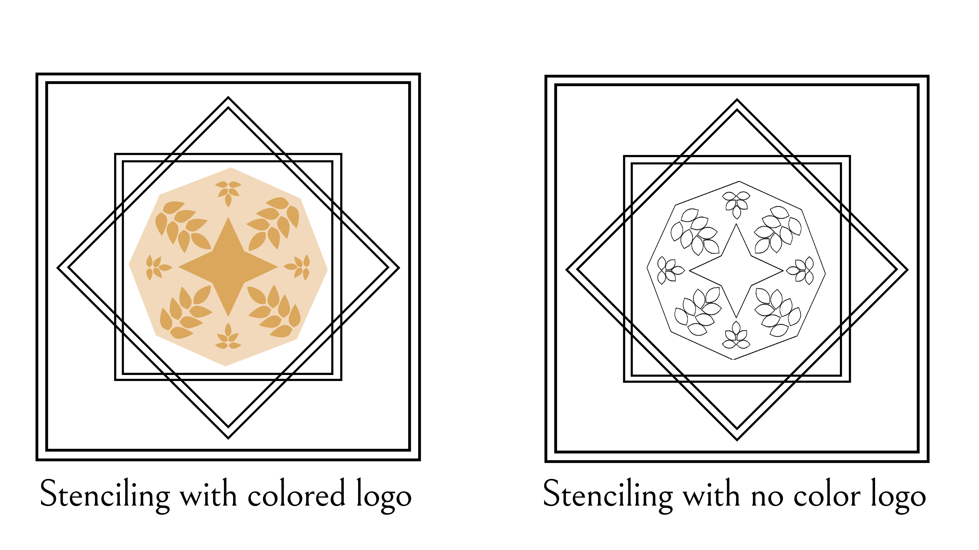
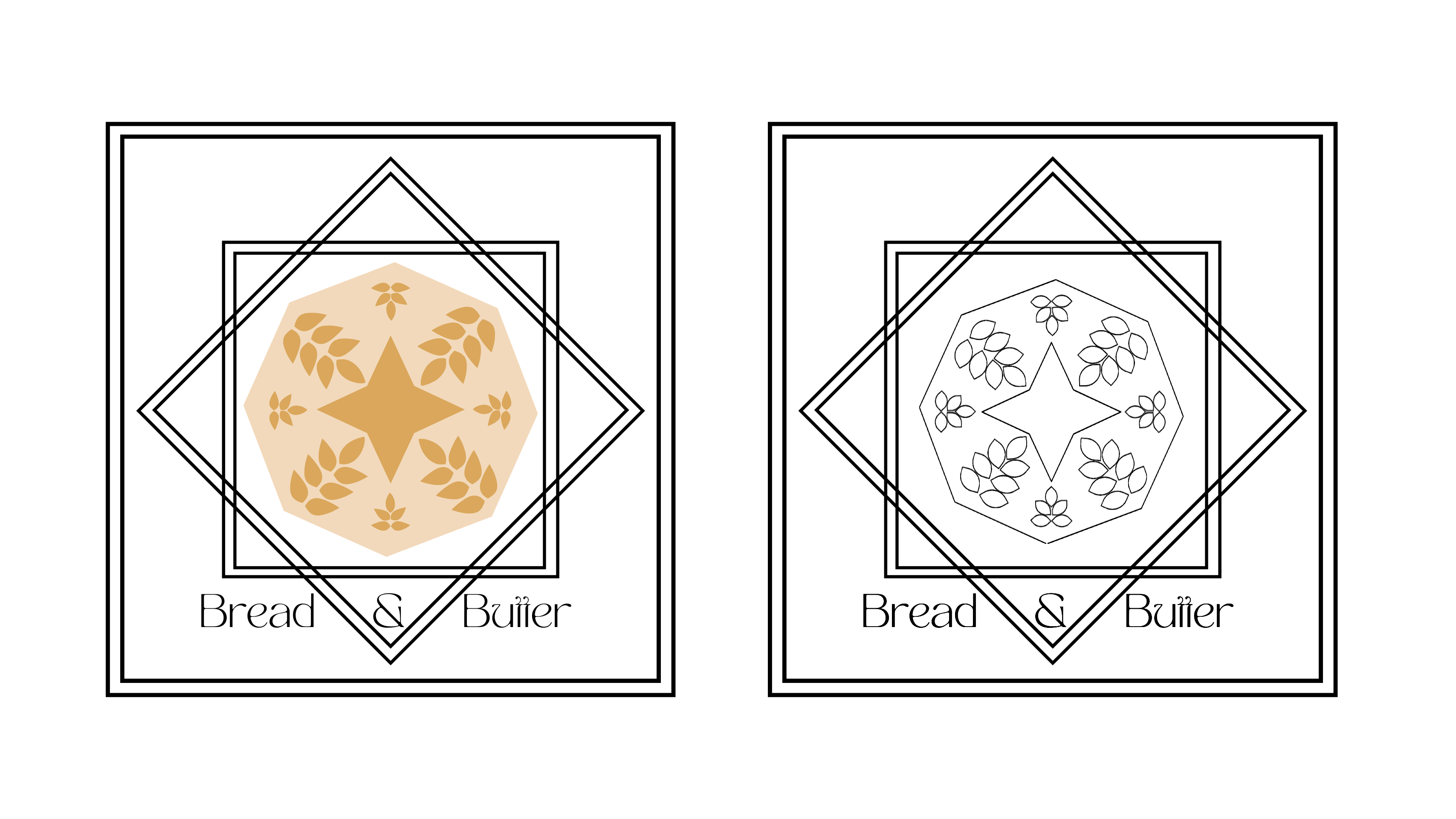
After experimenting with several typefaces from my research, the final logo result can be seen below.
The Mockups
The Website
Baked using high-quality, locally sourced ingredients and traditional baking methods. by Savannah Sapp


