Services Provided:
- Logo Design
- Brand identity
- Packaging Design
- Limited Edition Merchandise
- Menu boards and Menus
- Interior Design
- Displays
Table of Contents
- The Background
- The Concept
- The Solar Punk
- The Process
- The Packaging
- The 3R’s
- The Menu
- The Cafe
- The Furniture:
- The Panels:
- The Mission:
The Background
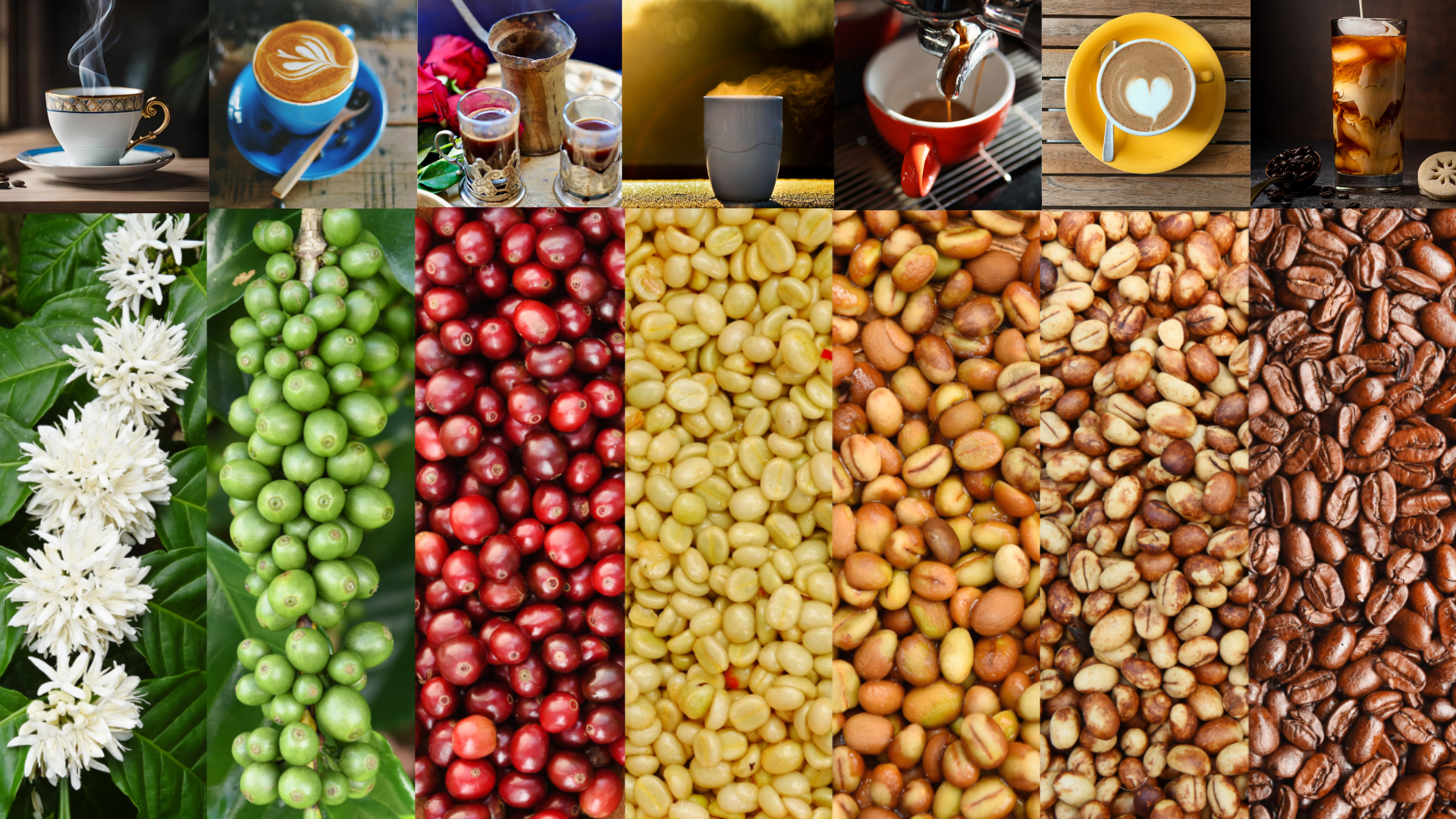
My client enclosed the following as something they wanted:
We are thrilled to have the opportunity to work with you on our new packaging design project for Bean Bliss Coffee. Our aim is to develop coffee cup packaging that truly embodies our brand’s modern, eco-friendly, and community-focused identity, while also appealing to our target audience of young professionals, college students, and coffee enthusiasts who value sustainability.
Brand Overview: Bean Bliss Coffee is centered around the principles of modernity, sustainability, and community. We want our packaging to reflect these values through a design that is both stylish and environmentally conscious.
Objective: The primary goal is to create eco-friendly coffee cups that not only highlight our commitment to sustainability but also capture the modern aesthetic our audience appreciates. We envision these cups featuring our logo and tagline, “Sip Sustainably,” and being made from materials that align with our environmental values, such as recycled paper or biodegradable plastics.
Design Requirements: For the design, we would like to see the incorporation of earth tones – greens, browns, and beiges – to emphasize the natural and sustainable aspects of our brand. The logo should be versatile, working well across different sizes and contexts. Additionally, we are open to the inclusion of secondary branding elements like icons or patterns that can enhance the overall design.
Concept & Ideas: We have three primary concepts in mind for this project:
1. Earthy Elegance: This concept features a minimalistic design with a prominent logo in the center, complemented by earthy background colors and subtle leaf patterns. The tagline should be placed below the logo in a clean, modern font. Small icons representing sustainability, such as a leaf or recycling symbol, could be integrated to reinforce our eco-friendly message.
2. Community Connection: This concept revolves around vibrant, community-inspired artwork, depicting illustrations of people enjoying coffee. The tagline can be wrapped around the side of the cup, creating a dynamic visual element. Including quotes about sustainability and community can further emphasize our brand values.
Typography: We prefer a modern, clean font for the tagline and any additional text. It’s important that the font is easily readable, especially at smaller sizes, to ensure clarity and effectiveness.
We believe these concepts will help us connect with our audience while staying true to our brand’s core values. Please let us know if you have any questions or need further clarification. We are excited to see your creative ideas and to collaborate on brining Bean Bliss Coffee’s packaging to life.
As the conversation continued, it was requested I design the shop, menu, menu-boards, displays, and limited-edition merchandise.
The Concept
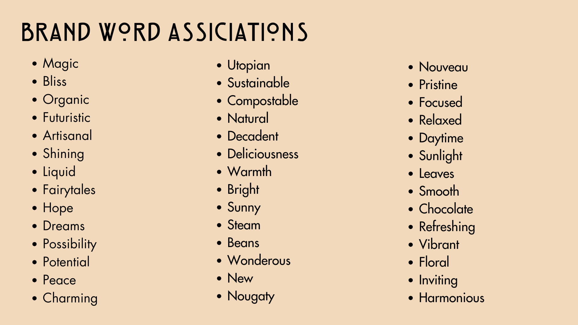
Bliss is an interesting word; I decided to take the brand concept and see what kinds of words reminded me of the company name and the overall identity of the brand. These are the words I came up with.
When I think about earthy colors and coffee beans, I cannot help but think of fairytales like “Alice in Wonderland,” “The Secret World of Arrietty,” or “Jack and the Beanstalk.” After all, it is the magic beans that make coffee so blissful.
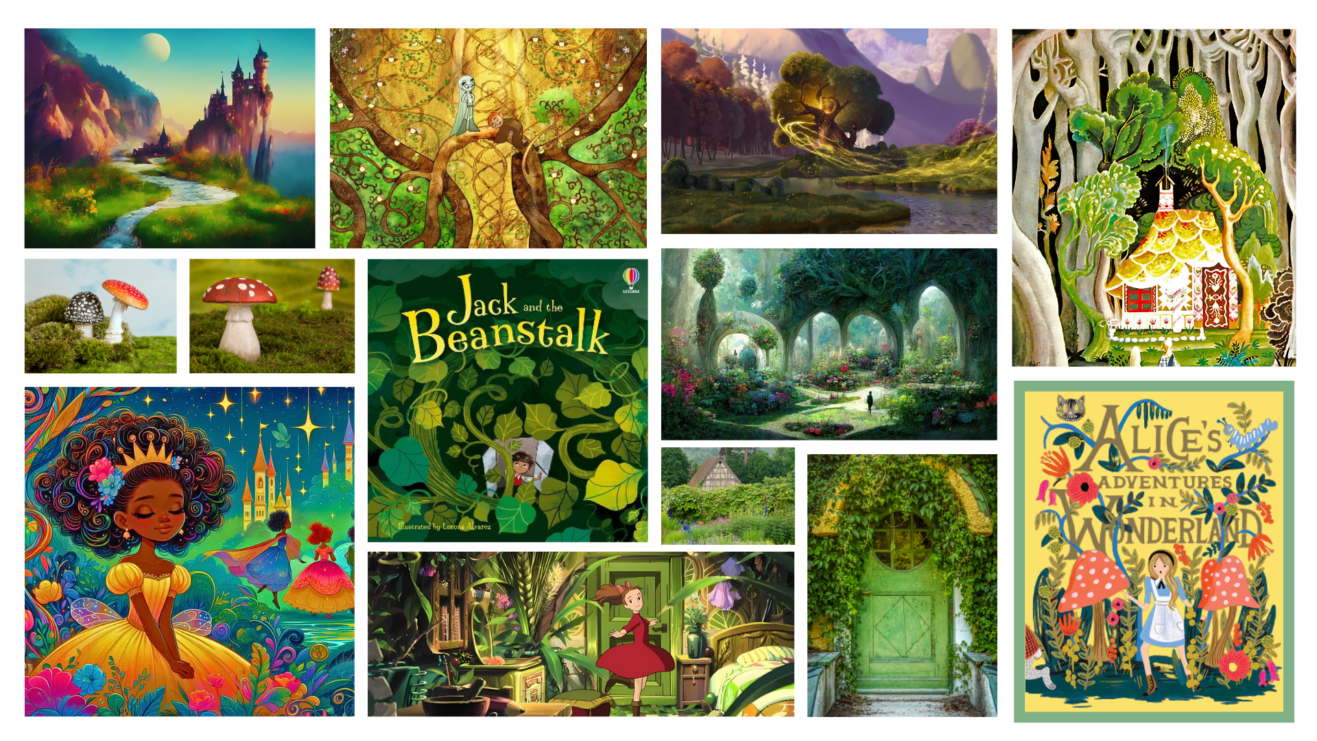
But there is so much more to this than just a fairytale; and by making the image exclusively like a fairy garden might make the brand’s mission seem more like an out of reach myth than a possible dream. So I wanted to keep looking to add to the influences I drew from.
Fairytale illustrations in children’s books have a similar influence to another artform; advertising. Early turn of the century (1900’s-20’s) marketing was heavily influenced by a style known as Art Nouveau. The Art Nouveau movement incorporated natural vines, organic and fluid patterns, and heavy lines. More importantly, it is an influence on many coffee shops today. The overall shapes and patterns compliment the steam from a cup of tea or the swirling of the coffee and milk in a cappuccino. In a way, Art Nouveau is the tried and true.
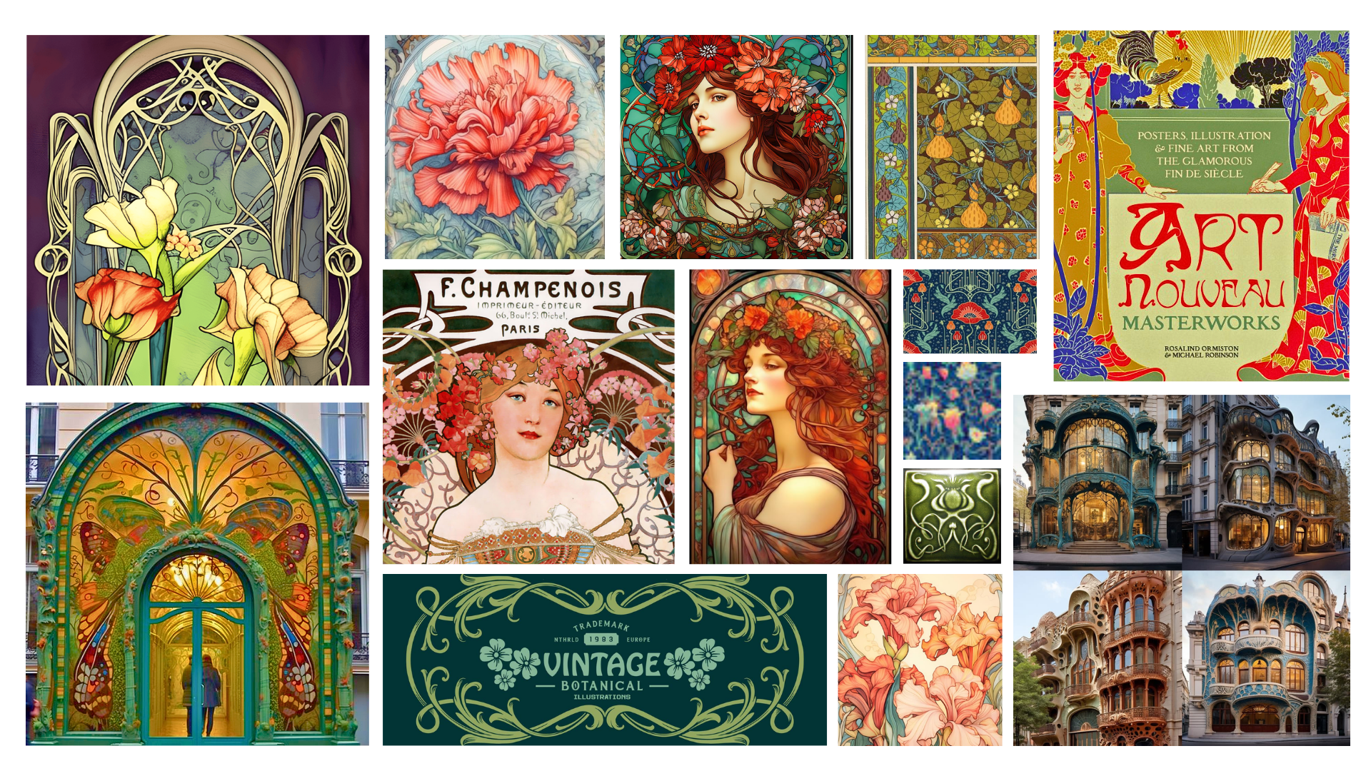
The influence is perfect, but I pondered on two other issues: How to make the brand something unique and not overused (a fresh take on something traditional), and, What about what I am doing is modern and futuristic? That is when I had an epiphany, or perhaps a bout of nostalgia. See the image below.
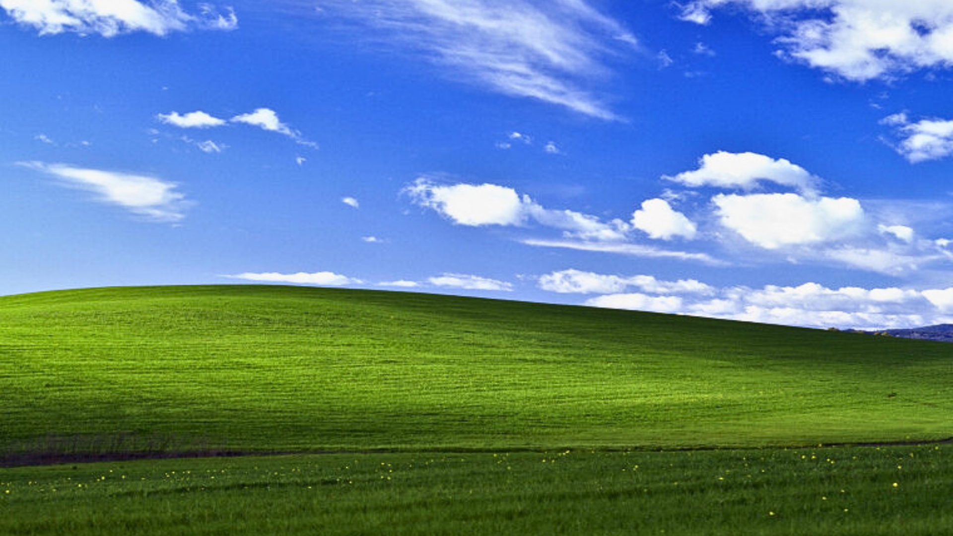
This image is known as, “Bliss” and was the default wallpaper for Windows XP. More details here.
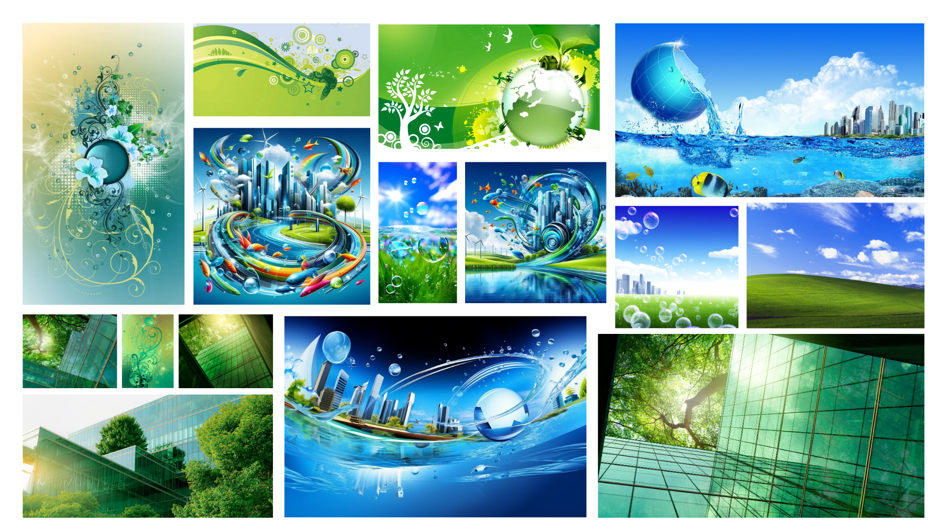
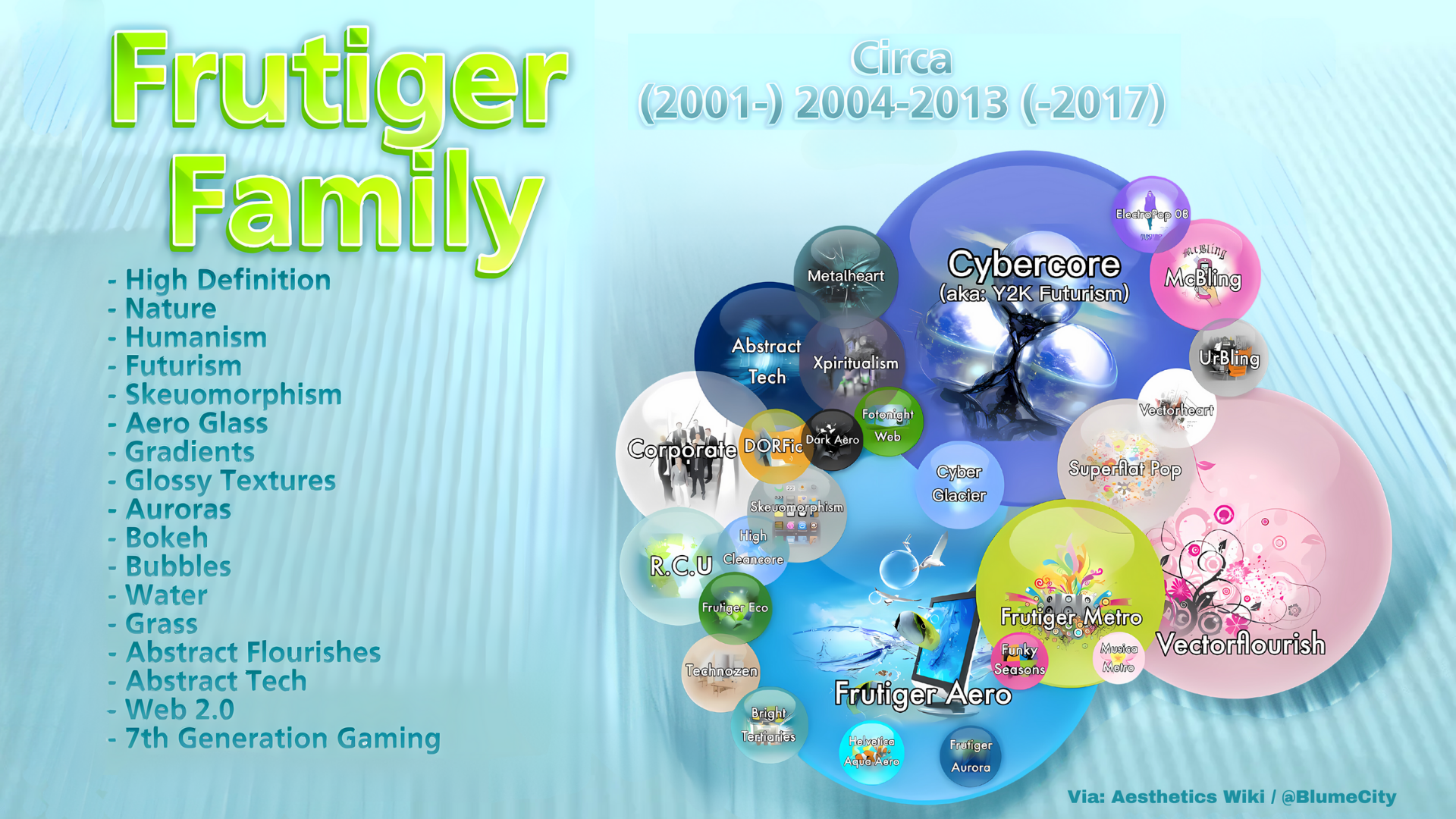
I recalled my childhood and the marketing and decorative aesthetics of the 2000’s. That’s where Frutiger comes into play. Glossy images, bright cheery colors (yet earthy colors), bubbles, water, sky, fresh grass, vine patterns, organic shapes, futuristic and environmental consciousness –the Frutiger aesthetic was the perfect inspiration. When studying artistic movements, there has been a recent study on aesthetics. What I have attempted to describe is what is known as Frutiger because of a typeface created by a designer named Adrian Frutiger. His typeface was used frequently with the artistic style previously mentioned thereby having the aesthetic named for him. Below are some of the images used to create Bean Bliss Coffee’s logo.
The following image better describes some of the elements used to create the overall look of a Frutiger design.
But what if there is actually something that takes the above mentioned concepts even further? Is there something out there that demonstrates these styles in a cohesive way? Enter Solar Punk.
The Solar Punk
A Miyazaki fairytale meets the Frutiger aesthetic; Solar Punk takes our understanding of past inventions, nature, and simple machines and amalgamates them with modern technology. Through the use of alternative energy methods, sustainable and limited/zero waste or reduce, reuse, recycle ideologies, Solar Punk societies provide communities that live alongside nature. It is hopeful, dreamy, and obtainable.
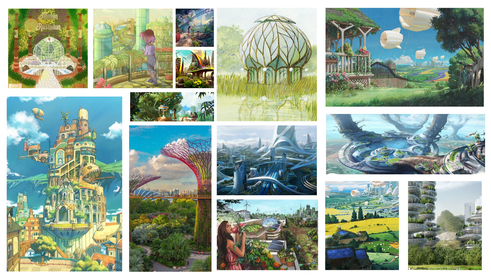
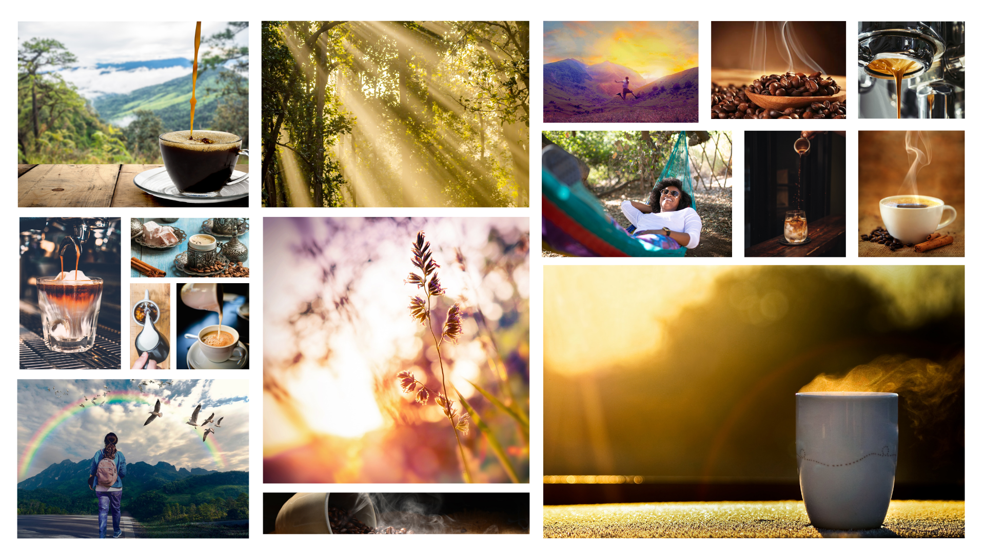
I noticed something special about the colors used in many artworks of the Solar Punk movement; many pieces contained a gorgeous yellow-green color that I have usually only seen when the sunlight shines through the leaves on the trees. I thought about all of the spring days I spent playing in the forest (I grew up in the countryside.) That moment for me was bliss, and I knew that the “earthy” colors I used had to go beyond the typical sage greens and into something that captured this memory. (See below)
The Process
I decided that one of the images from my Solar Punk mood board best represented the colors I wanted to capture for the brand. (See below)
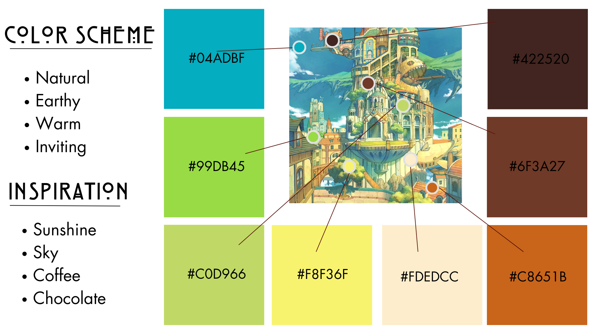
A sunny day with a warm cup of coffee, this warm pallet covers it all!
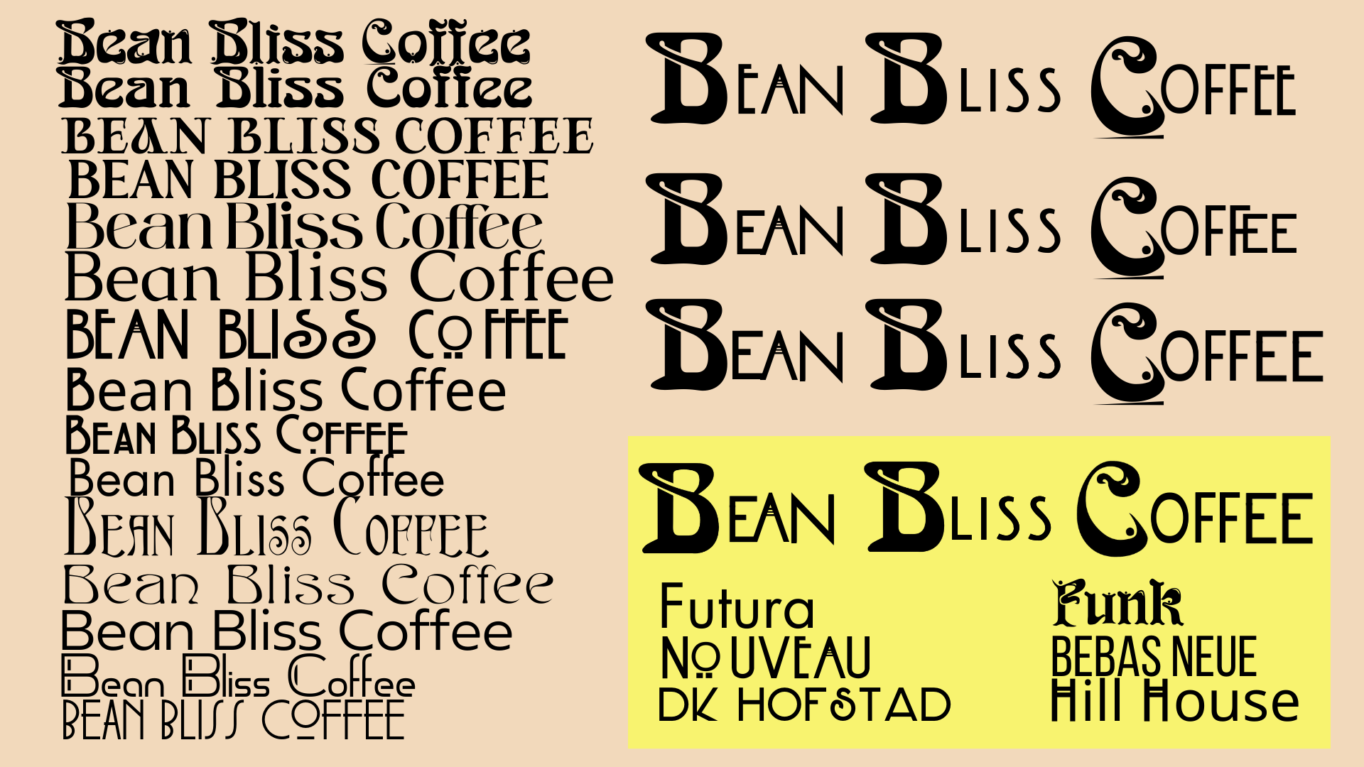
The typeface was requested to be sleek and modern. I drew my inspiration for the fonts used from the Art Nouveau movement to create a unique lettering style for the company logo.
The logo went through a couple of variations. However, I really wanted to utilize the glossy style of the Frutiger aesthetic. I turned the logo into a beautiful gloss icon by drawing the base image in Procreate and layering effects over the image in Photoshop and Inkscape until I achieved the glossy image I desired.
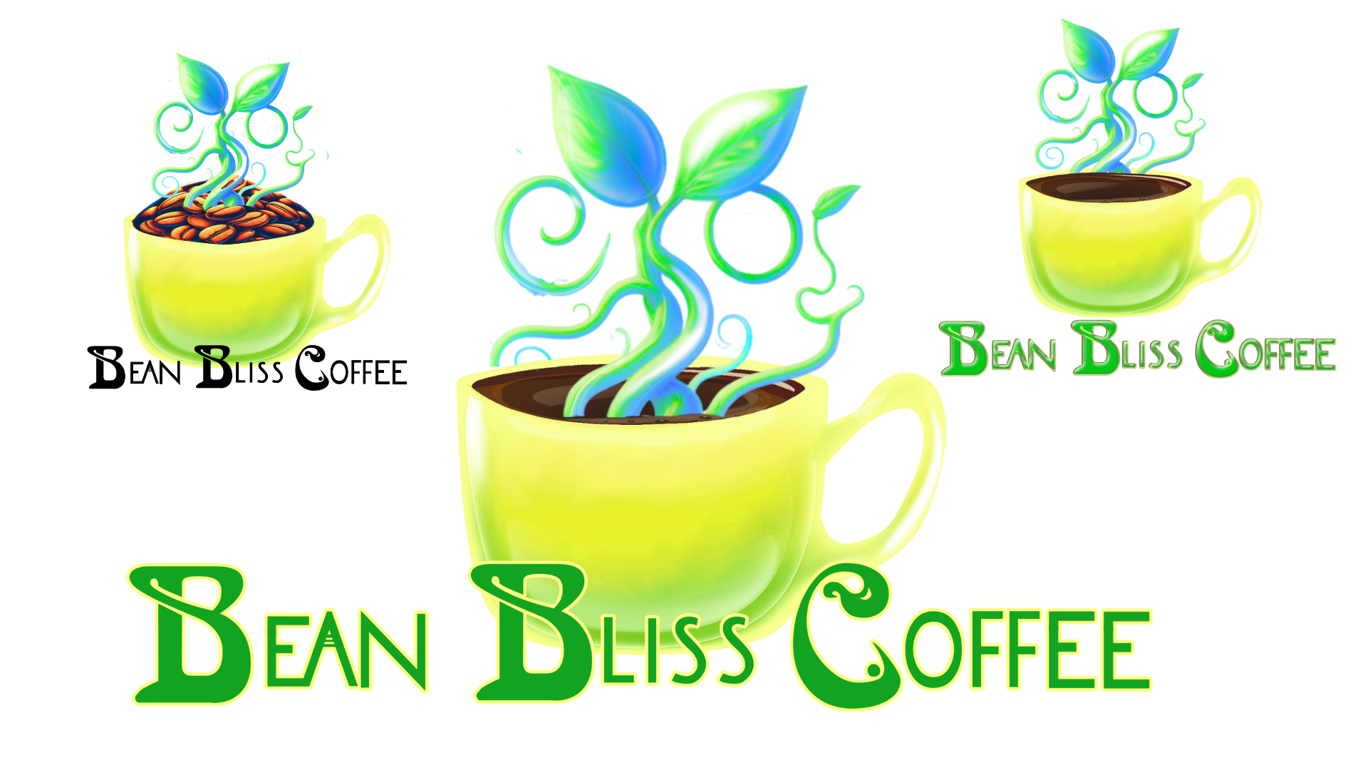
The fairytale imagery was also able to be set into motion as the beanstalk emerges from the coffee cup. I had previously considered using coffee beans but reconsidered the idea as the details could be lost in smaller sizes. Instead, the beanstalk is rising (like rise and shine) from a cup of coffee.
Another issue I came across was the color of the lettering. Nothing seemed to fit. The brown was too dark and so was black. Deep green did not match the brand colors and reminded me of the Dreamwork’s Shrek logo. So I began to experiment.
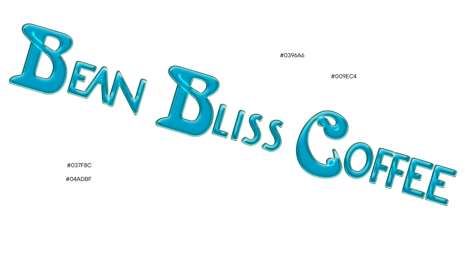
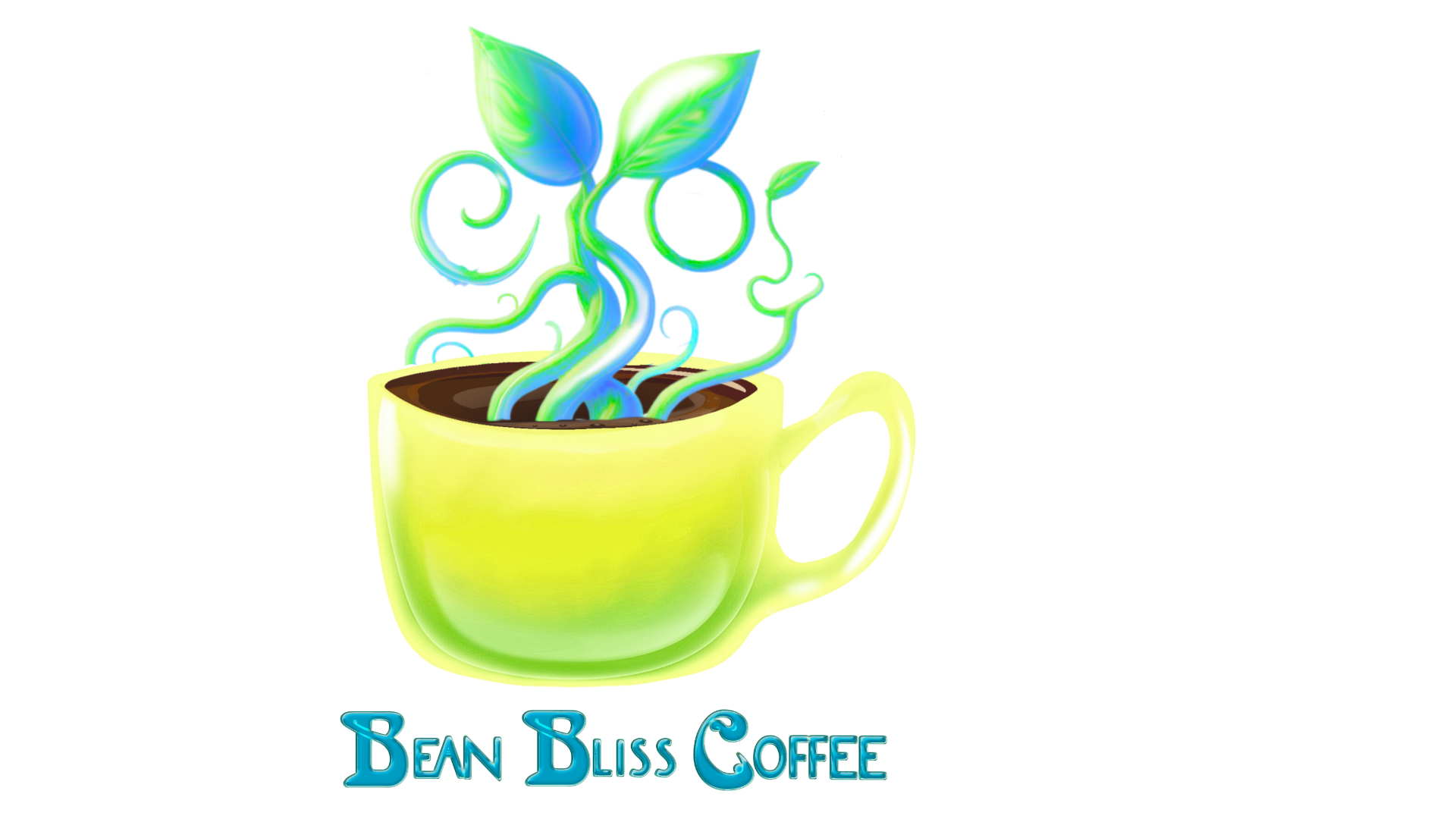
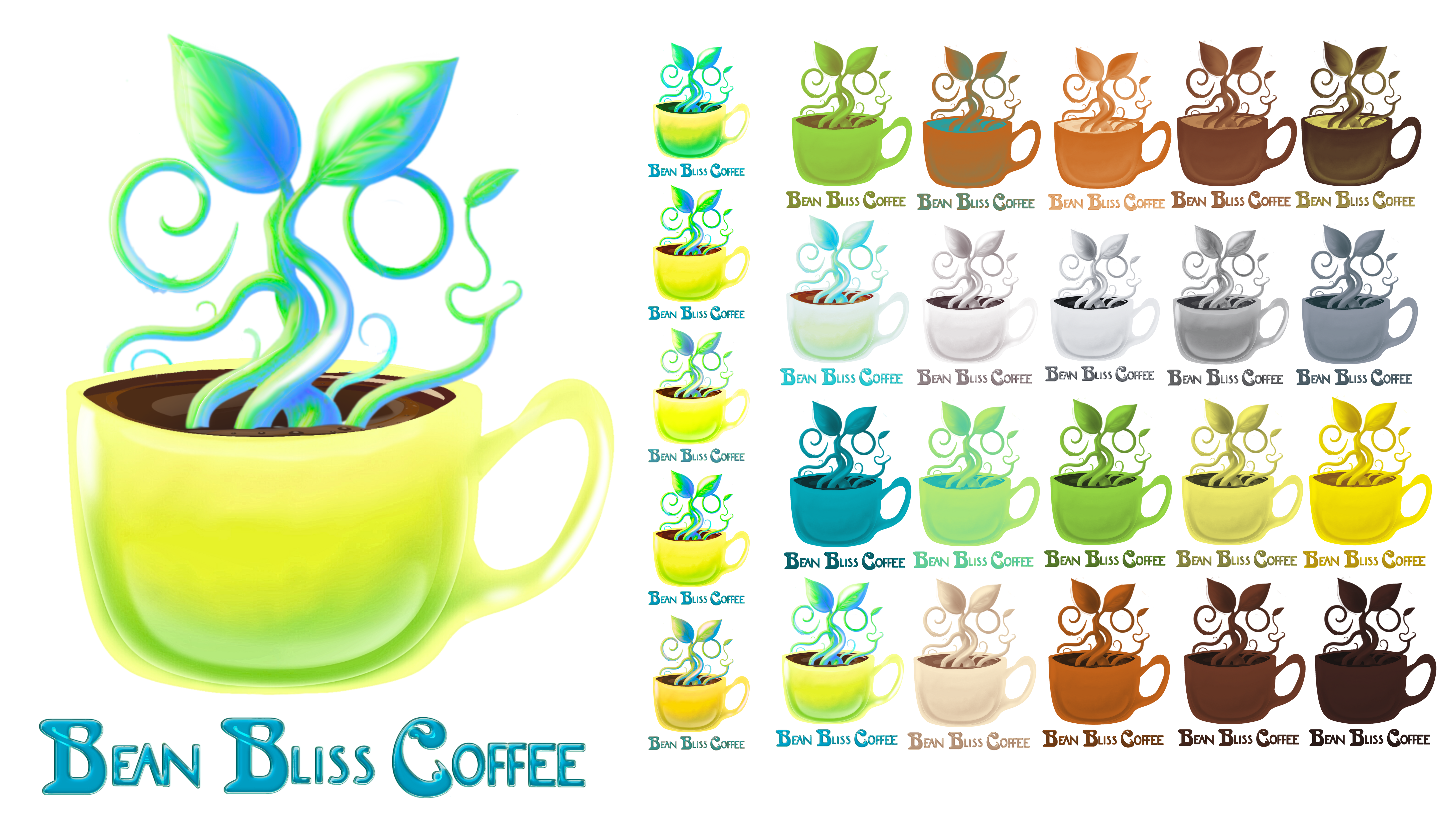
The sky teal color from our pallet actually worked really well and served as a beautiful transition from the bright sunny day yellow and grass green to the rich coffee browns. I experimented a little in Inkscape to create this glossy effect to tie it in with the logo. As a result, the logo became the image below.
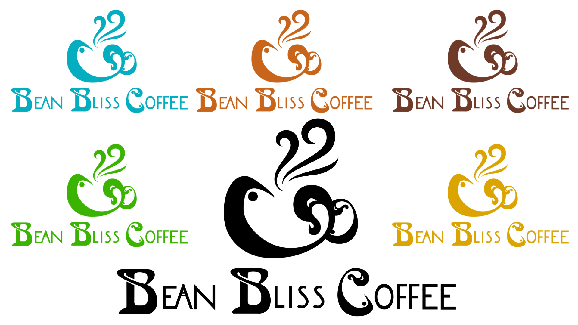
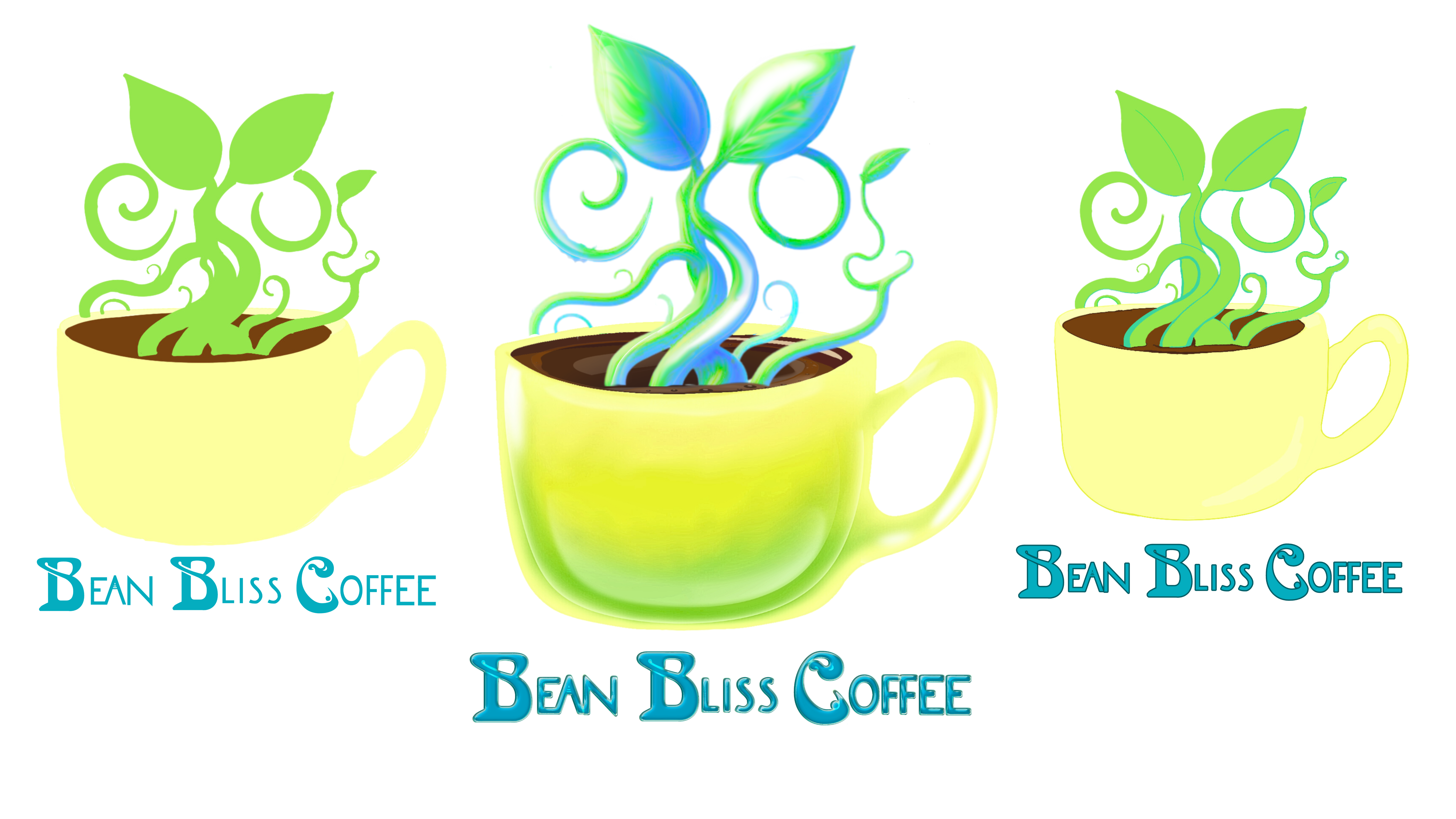
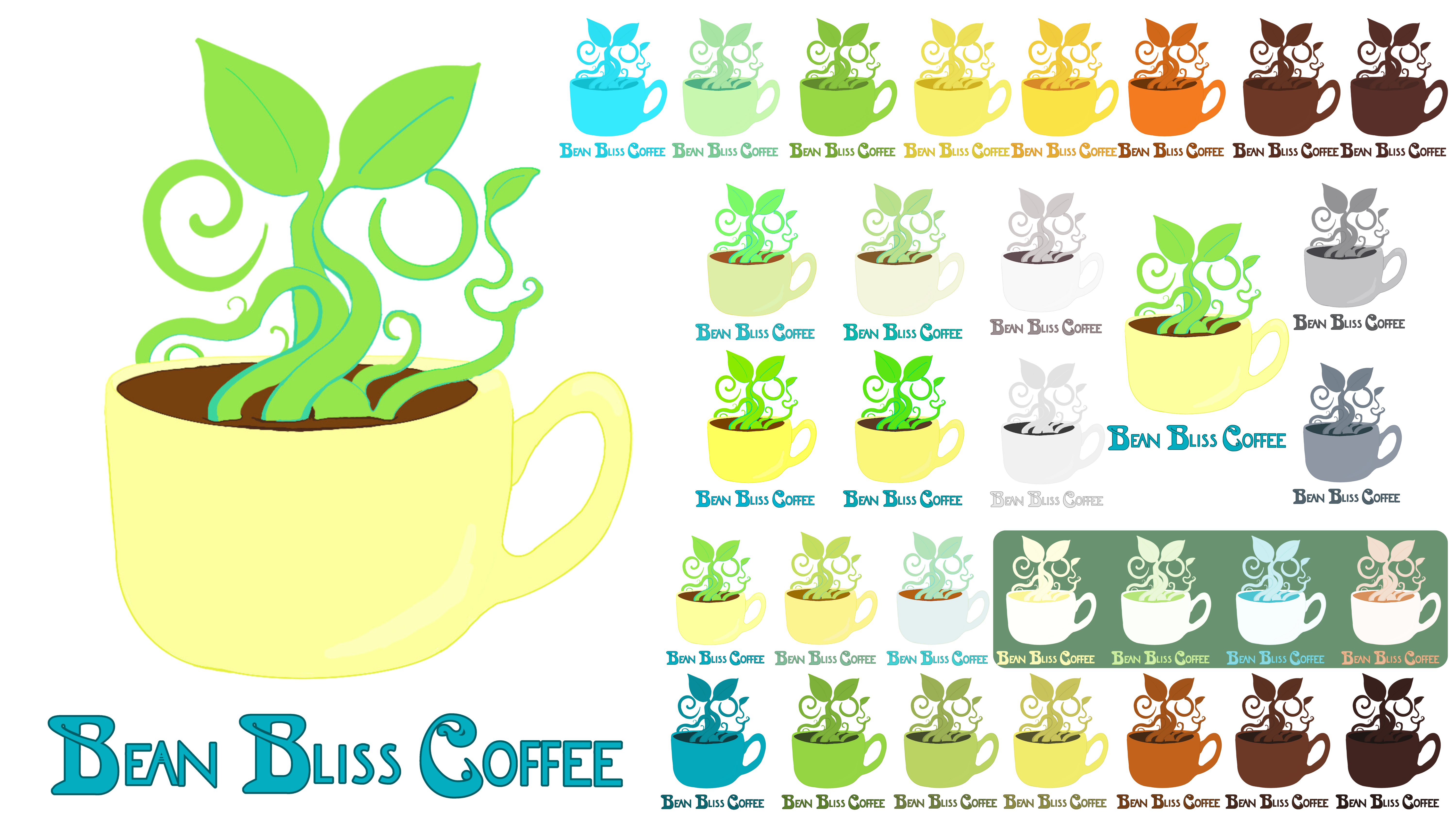
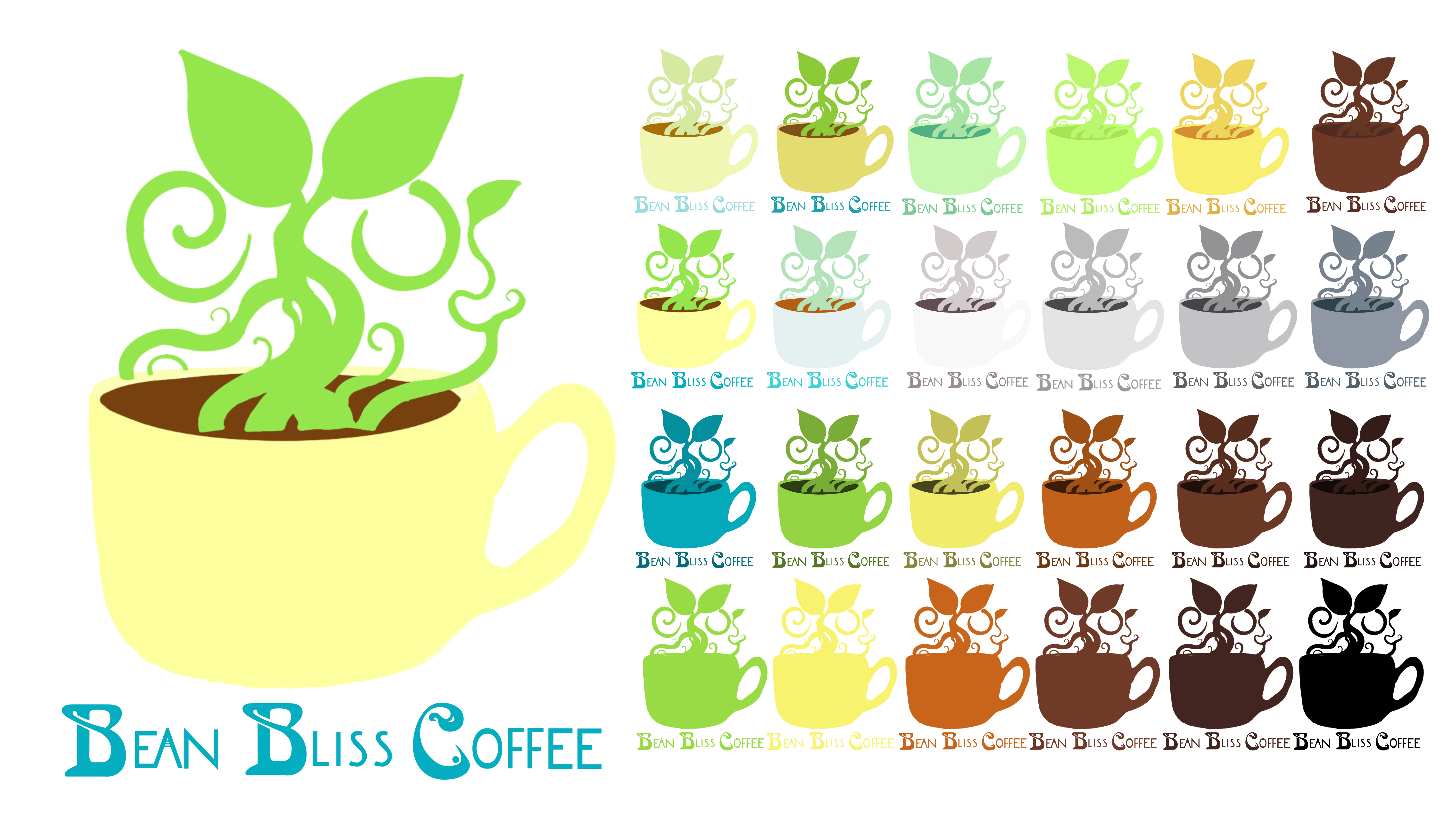
Due to the fact that my design was heavily influenced by a trend popular ten years ago, I wanted to see if it could withstand modifications based on trends, print mediums and possible needed color changes, etc. Below is what I came up with.
The Packaging
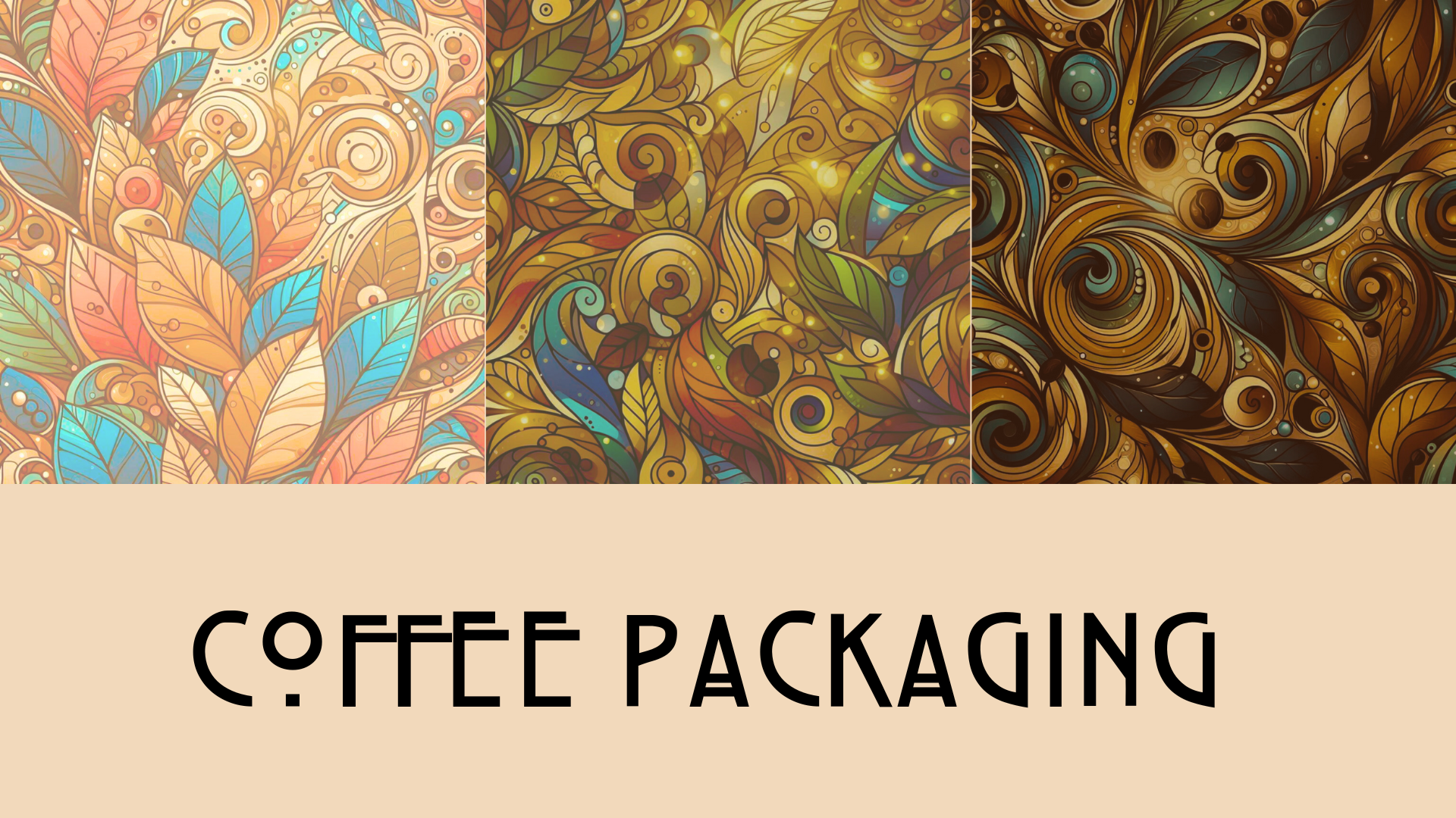
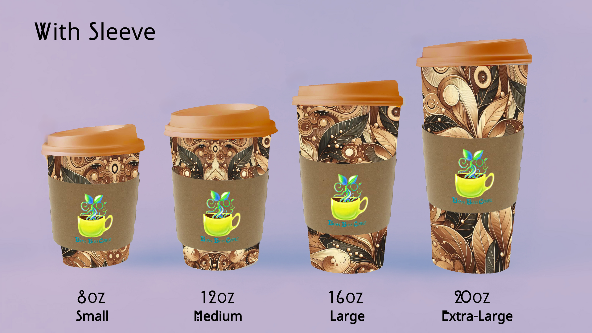
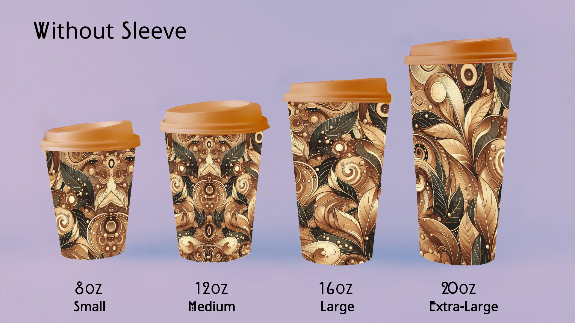
I wanted to pay more homage to the Art Nouveau aesthetic and decided that nothing would be better for the packaging than a gorgeous floral print that gradually changes and gets darker as it represents each roast.
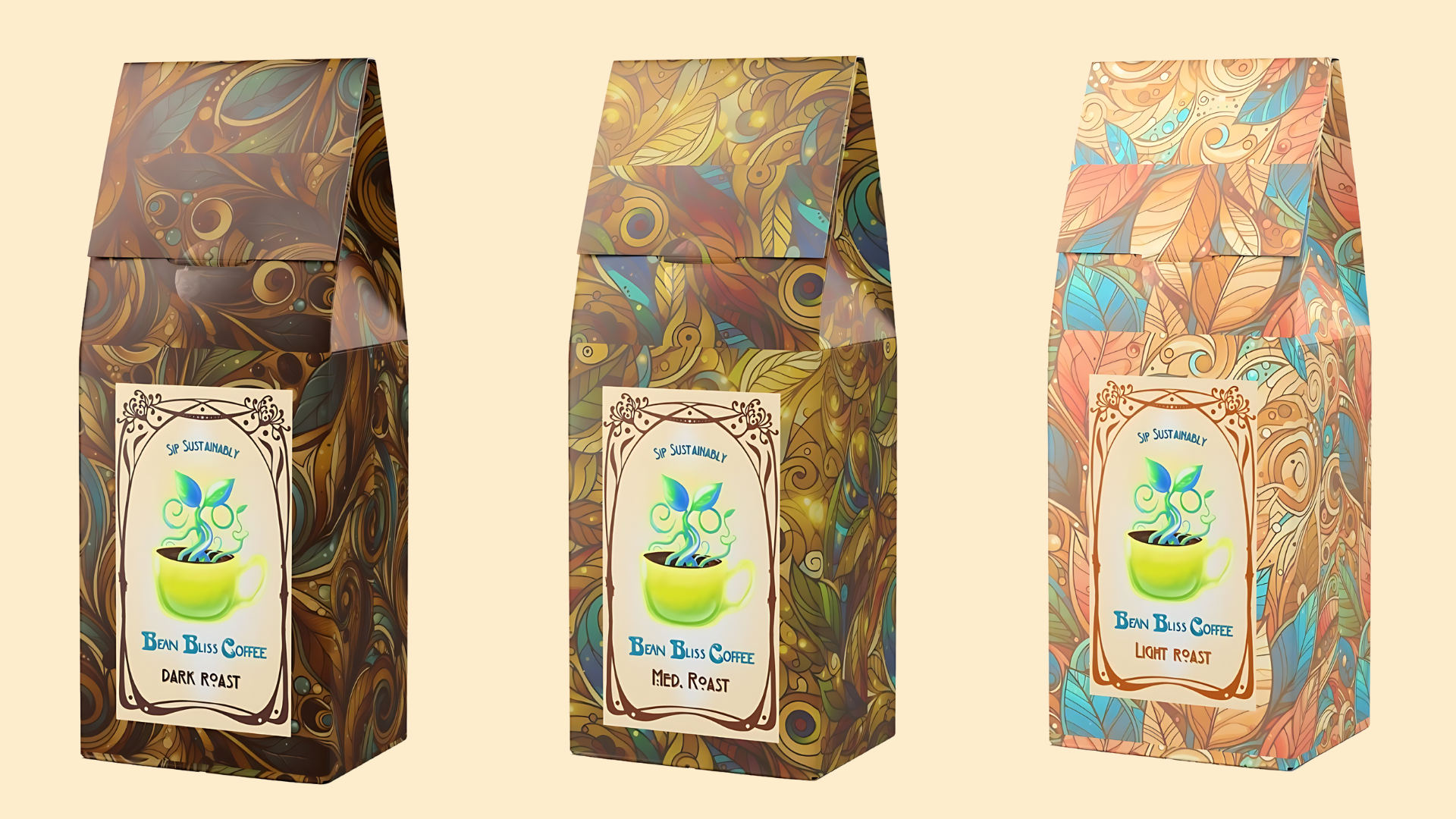
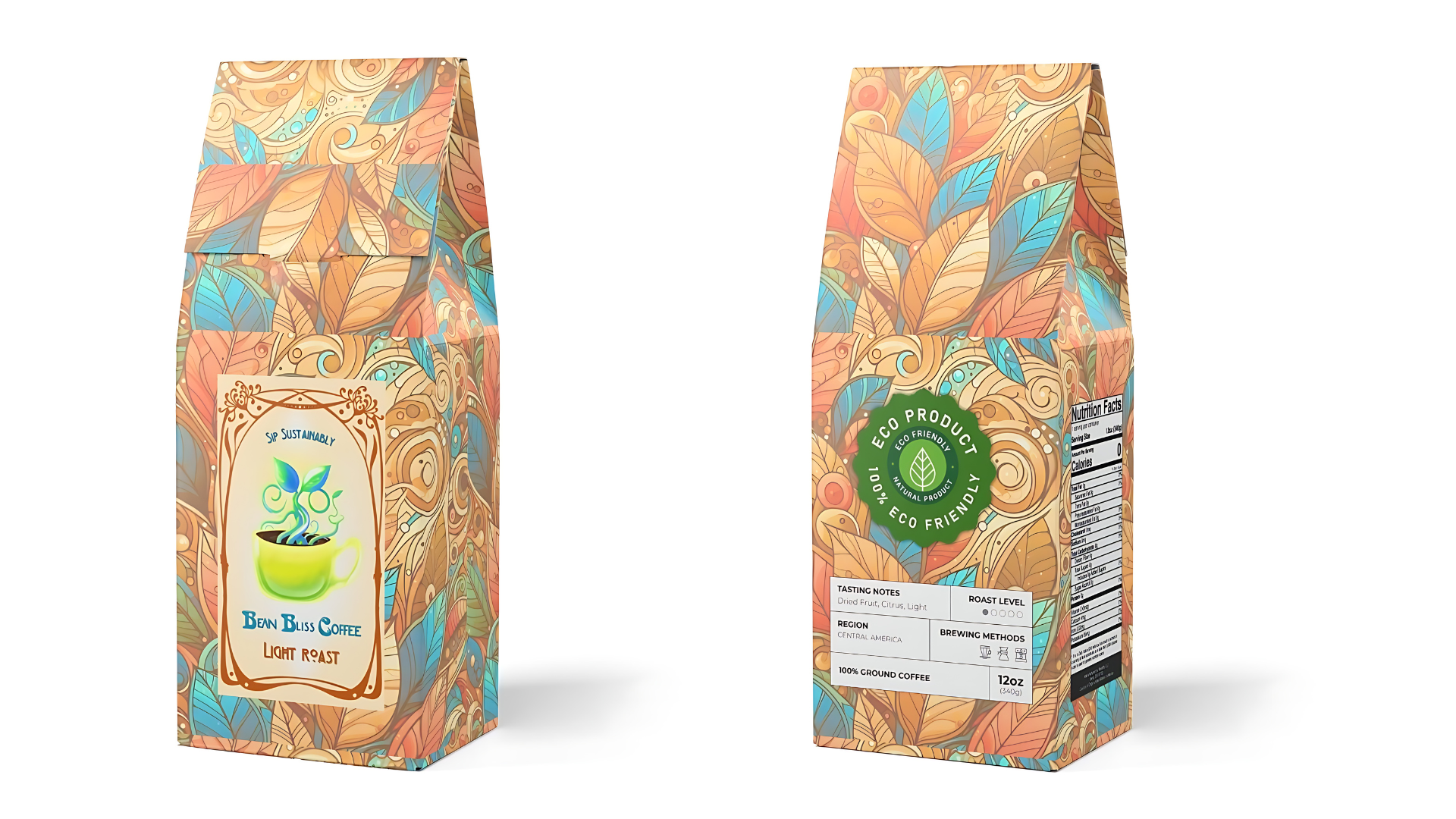
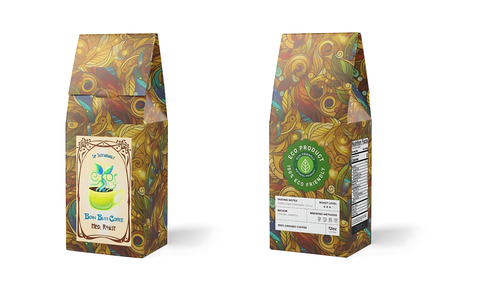
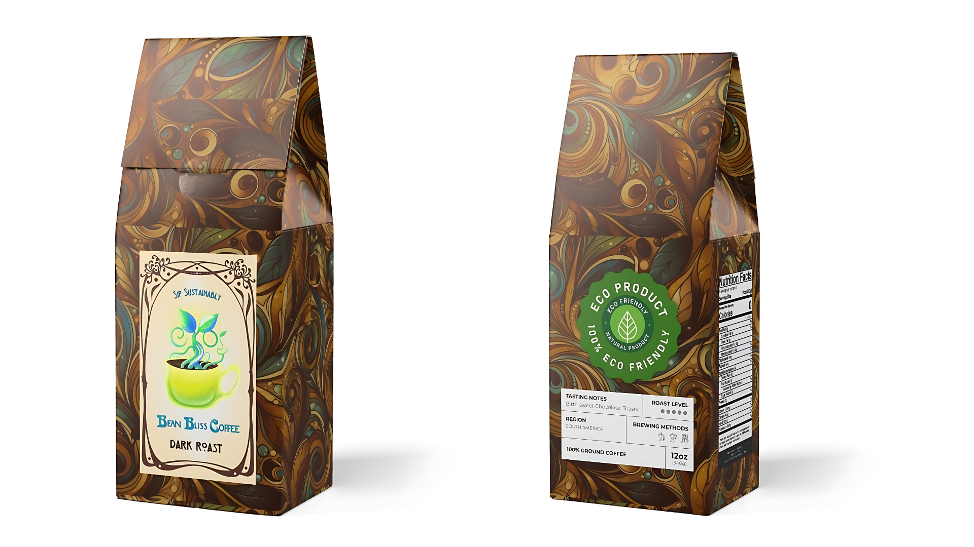
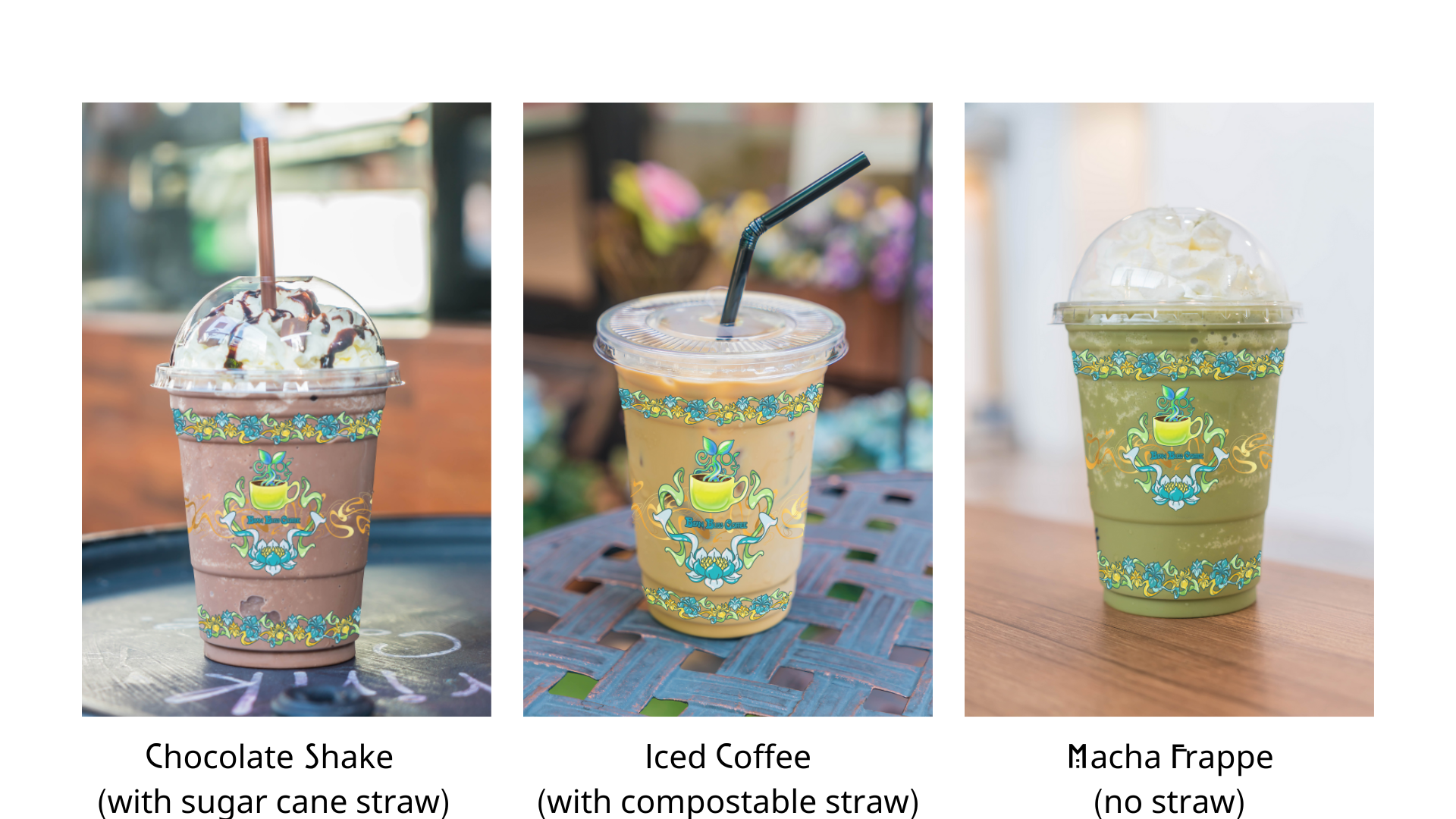
To-go cups:
The 3R’s
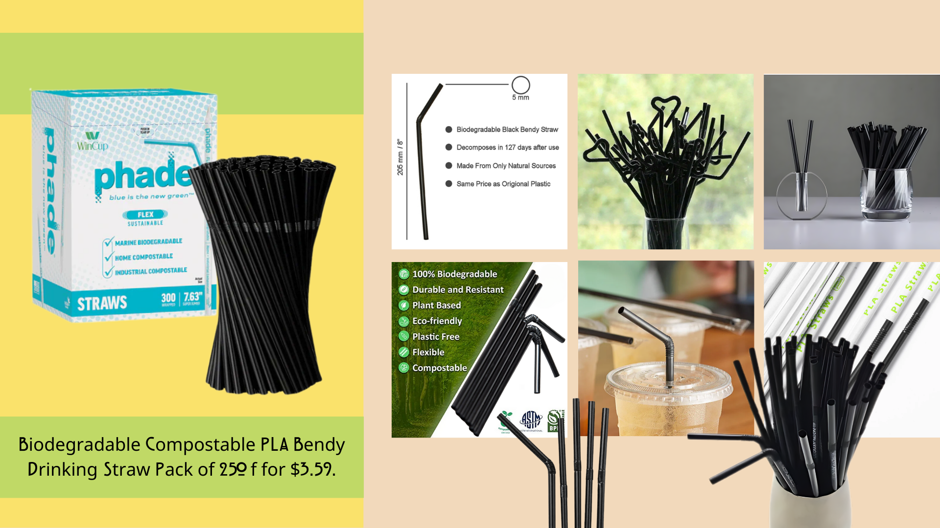
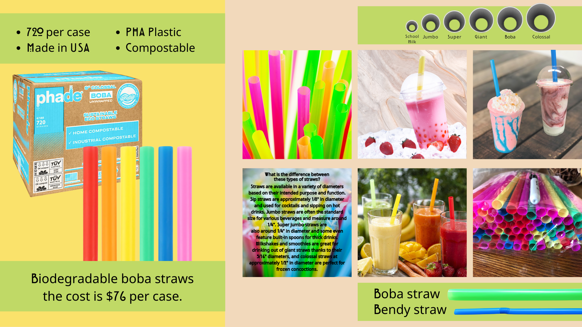
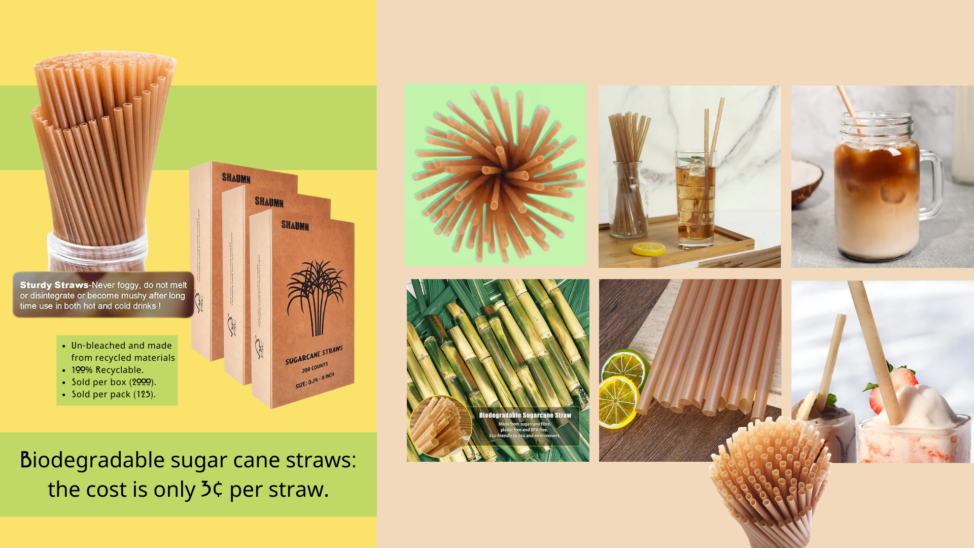
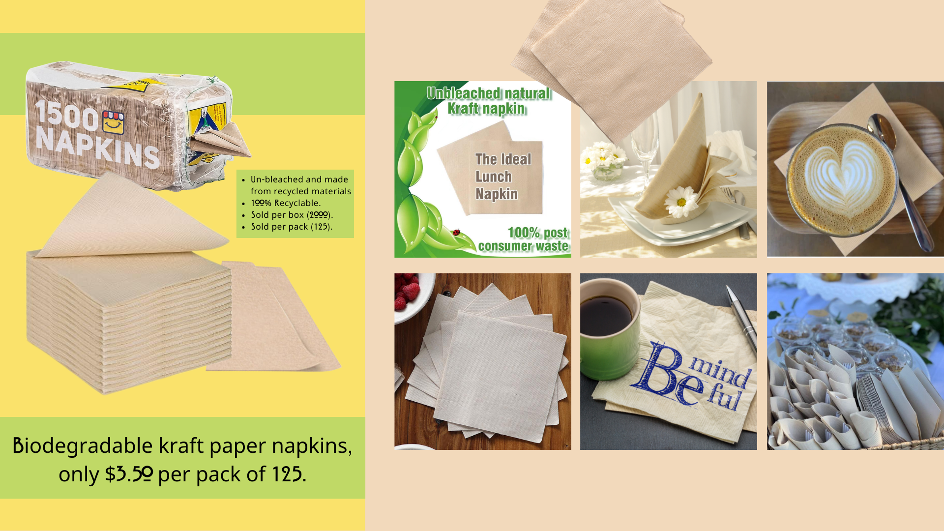
Back in the 90’s the phrase was, “Reduce, Reuse, Recycle.” Now, businesses have been making the effort to take further measures by making products that are not just biodegradable, but also compostable. These are some products and price points I found that fit in with the brand.
The Menu
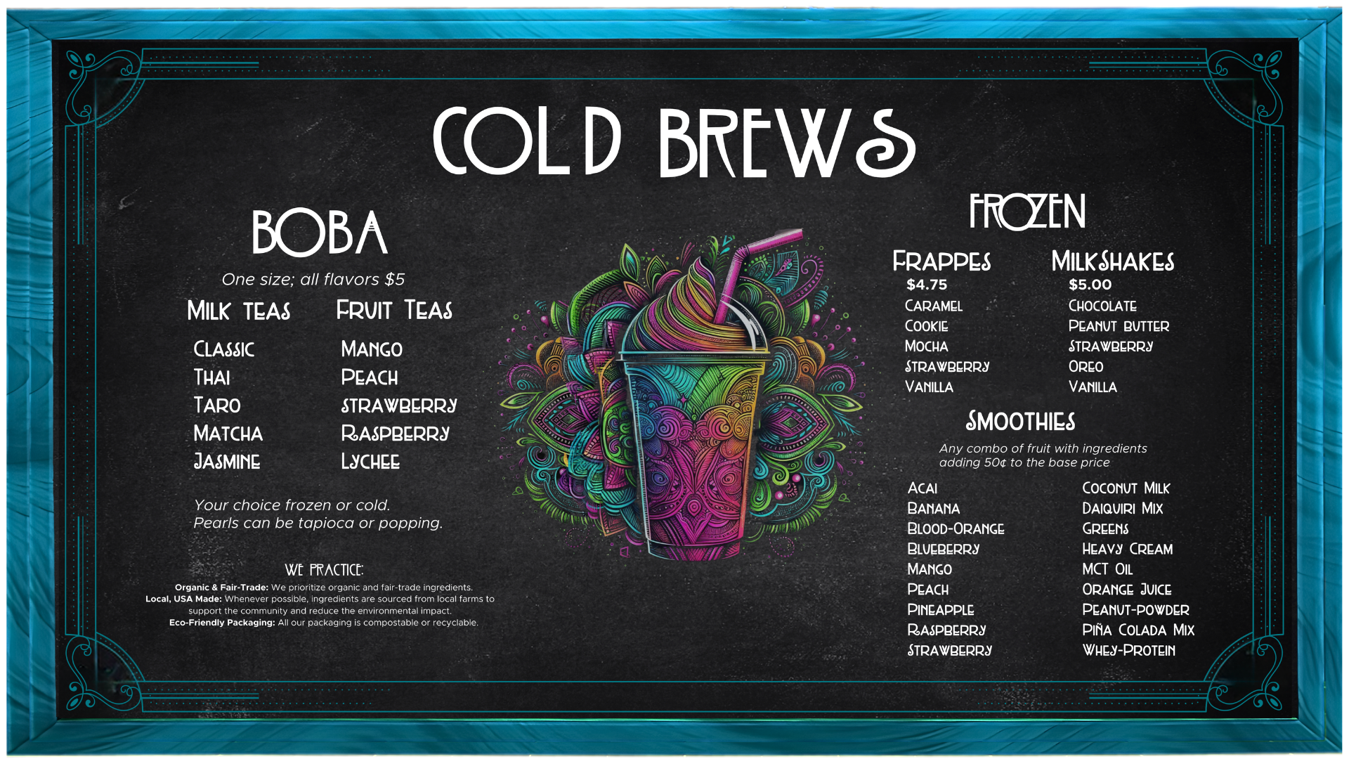
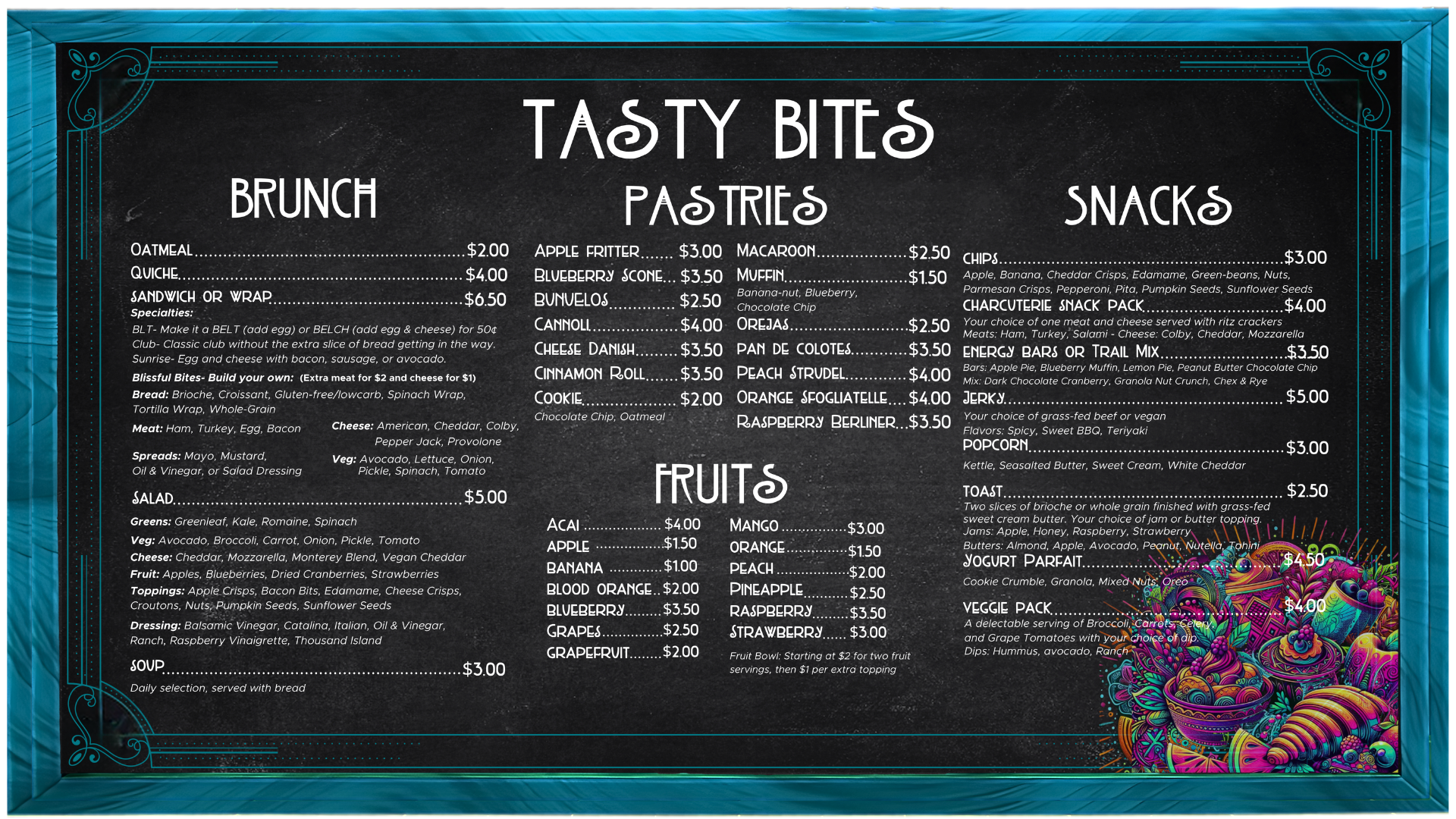
The Cafe
Bean Bliss Coffee Cafe (Presentation) by Savannah Sapp
Displays:
In slides 1-8 you can see the front displays. I wanted them to convey the feeling of bliss but also fit into our aesthetic. We used upcycled “junkyard” metal to create the sculptures in the displays. We use some of the solar from the top of our building to power our lights as well.
The Building:
While looking at our building, it appears new. In some ways it is, and in other ways it is not. Our back wall for example, is completely made of bricks from old mills and foundries that have since been torn down. We were able to purchase doors from a hotel renovation as well and so the doors to the bathroom stalls are from that. One of the founder’s beloved uncle works in construction. The floor tiles are salvaged and saved tile that was simply going to be thrown out. It is surprising just how many materials perfectly good and new get thrown away at the end of a job, this inspired us to use as many elements from these projects as possible.
The Bathroom:
Slides 16-22 feature our bathrooms. We have a unique take on how bathrooms should work. In several countries, (Germany and Japan to name a couple) people have started moving away from stalls and into full room spaces or at the very least stalls that touch the floor. This provides full privacy for the users. There are three stalls for everyday users and two stalls for family and handicapped. Yes, even the changing tables are private. The sinks are accessible to all so your safety and privacy are equally valued.
The Furniture:
We leaned heavily into the Frutiger Aero and Retro aesthetics for this portion. Some of the elements are art deco in small accents. However, everything goes back to the brand and its brand colors. These funky swirled squiggle patterns appeal to the primary demographic Gen-Z worker and college student. However, we wanted everything to be calming and comfortable even if you were just a mom coming in the middle of the day for a destress or a quick bite–or anyone for that matter.
The Panels:
We use our solar panels and build up reserve energy. Unfortunately, our windmills are decorative, but we are able to run solely upon the power gathered from our panels. But that is the thing about energy alternatives, we have to keep trying until we find one that works for the region, we are in there may not be one universal answer. Nevertheless, it is a responsibility that we feel we must pursue in some form or another.
The Mission:
The mission is stronger than our coffee. We wanted a shop and products that show how the world can be and hopefully will be. Bean Bliss is an opportunity to see potential and invest in it. Through the use of fair trade, local business support, sustainable energy, salvaging and giving life to old things we really can make a difference, and it doesn’t have to cost us our lives or our pockets.
